I am pretty sure, before beginning to read this tutorial regarding vertical tab menu you scanned through to bottom to find if it is relevant to your study. This is a common behavior of web visitors. So, that’s where tabs come in handy to show your visitors what your page contains and that too, in a grouped managed location. A properly designed tabs menu provides a strong UX. Therefore you need to consider using tabs menu whenever you design single page web applications. You can design tabs vertically, horizontally or by using icons or images in variety of ways. A common way includes Javascript or other related frameworks. But in this tutorial we will be focusing on building vertical tabs menu with pure CSS and HTML. We will work with html and pure CSS code and build a simple,yet beautiful, example of vertical tabs menu.
Okay, lets get on to the interesting part of actually building the vertical tabs menu with pure CSS and of course, HTML.
Vertical Tabs Menu Tutorial with Example Using HTML and CSS
We will be building an example of vertical tabs with pure CSS and HTML
Step 1: Adding HTML
Should I even introduce the topic?? Very well, It builds the skeleton of your page. But before you get on to adding HTML lets discuss some peculiar elements that we are going to add that makes this tutorial special. Since we are restricting the use of javascript, and just with pure HTML and css, building tabs menu gets a bit complicated. So before moving forward to building our tabs menu with css lets understand trick behind it. You know about radio buttons, right?? We will be exploiting the very feature of this button which restricts the selection of other button under the same name. So, given the following HTML code for vertical tabs menu, we will be focusing on the radio button.
<h2 class="header">Pure HTML CSS Built Tab </h2>
<ul class="tabs">
<li class="tab">
<input class="radioClass" type="radio" name="tabs" checked id="tab1" />
<label for="tab1">HTML</label>
<div class="content">
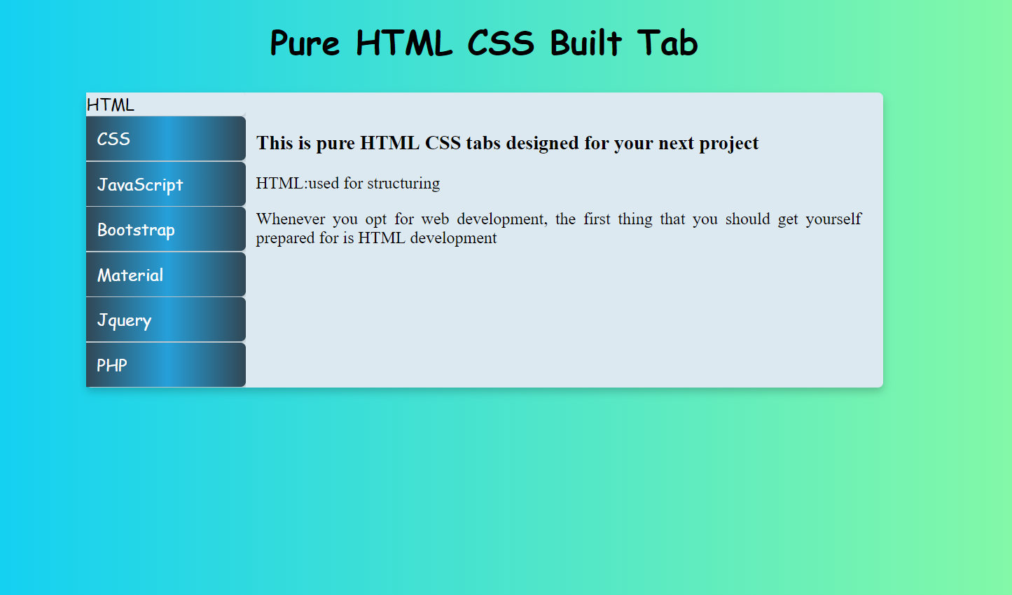
<h3>This is pure HTML CSS tabs designed for your next project</h3>
<p>HTML:used for structuring</p>
<p>Whenever you opt for web development, the first thing that you should get yourself prepared for is HTML development</p>
</div>
</li>
<li class="tab">
<input class="radioClass" type="radio" name="tabs" id="tab2" />
<label for="tab2">CSS</label>
<div class="content">
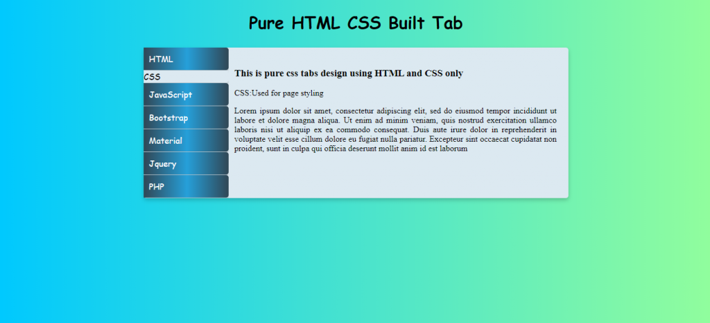
<h3>This is pure css tabs design using HTML and CSS only</h3>
<p>CSS:Used for page styling</p>
<p></p>
</div>
</li>
<li class="tab">
<input class="radioClass" type="radio" name="tabs" id="tab3" />
<label for="tab3">JavaScript</label>
<div class="content">
<h4>In this tutorial we design tabs for website without JavaScript. </h4>
<p>JS: Not used</p>
<p></p>
</div>
</li>
<li class="tab">
<input class="radioClass" type="radio" name="tabs" id="tab4" />
<label for="tab4">Bootstrap</label>
<div class="content">
<h4>In this tutorial we have desinged vertical tabs without BootStrap </h4>
<p>Bootstrap: Not used</p>
<p></p>
</div>
</li>
<li class="tab">
<input class="radioClass" type="radio" name="tabs" id="tab5" />
<label for="tab5">Material</label>
<div class="content">
<h4>In this tutorial we have built vertical tabs menu</h4>
<p>Material Design: Not used</p>
<p></p>
</div>
</li>
<li class="tab">
<input class="radioClass" type="radio" name="tabs" id="tab6" />
<label for="tab6">Jquery</label>
<div class="content">
<h4>Jquery could be used to develop vertical tabs menu</h4>
<p>Jquery: Not used</p>
<p></p>
</div>
</li>
<li class="tab">
<input class="radioClass" type="radio" name="tabs" id="tab7" />
<label for="tab7">PHP</label>
<div class="content">
<h4>In this tutorial we design tabs for website with pure CSS.</h4>
<p>PHP: not under frontEnd</p>
<p></p>
</div>
</li>
</ul>The header
Wow! I hope that’s self-explanatory. If not, then lets break it down. First of all the first code:
<h2 class="header">Pure HTML CSS built tab </h2>
Radio button
This is just a header!! Nothing interesting. Well moving on we have lists, a simple structure for this would be:
<ul class="tabs">

    <li class="tab">
        <input class="radioClass" type="radio" name="tabs" checked id="tab1"/>
        <label for="tab1">HTML</label>
        <div class="content">
          <h3>This is pure HTML CSS tabs designed for your next project</h3>
          <p>HTML:used for structuring</p>
          <p>Whenever you opt for web development, the first thing that you should get yourself prepared for is HTML development</p>
        </div>
    </li>
</ul>
Here we extracted just one list items of class tab under unordered list (ul) of class tabs. Each list item contains an input element of type radio that means we’ve just created a radio button under the name tabs. Now see, the name attribute of radio button is important as it forms a group of all the other buttons having the same name so that when one button is active the rest automatically inactivates. The class attribute will be used for styling id is used for labeling and the checked value sets the the particular radio button checked as the page structures. Then we’ve added some text which will be displayed when each tab menu activates. That’s it. Other related list items are just redundant.
Step 2: Adding CSS
You did look at the page right?? That’s just texts and with buttons!! Where are the vertical tabs menu? Well lets get on to the essential part of this tutorial that is to code CSS so that we can visualize vertical tabs menu that lie therein the HTML structure.
Removing the default weirdness
.tabs .tab .radioClass{
    display:none;
}
.tabs .tab{
   overflow: hidden;
   width:20%;
}
Okay, here we have managed to remove those radio button and list items default bullet and check-box. The set width aligns all the texts within a block of 20% width so that later on with further manipulation we set only the menu tabs within that block. For now though that just seems so congested, lets deal with it. Moving on…
Removing the contents
Don’t get misled by this topic, We are just removing the display of the content for now.
.tabs .content {
    position: absolute;
    opacity:0;
    padding:0;
    top:110px;
    left:33%;
    right:22%;
    color: black;
    background:#DCE9F1;
}
One of the another important part of this tutorial to build a vertical tab menu lies in the positioning and stacking of the content. In the example above we have positioned the contents as absolute so that we can stack all contents together at the given position. Then we set their opacity to 0 removing their display to the screen. Other properties are just for a good design.
The resurrection
Your contents are removed from display .Okay! Stop panicking. Now lets resurrect them.
.tabs>.tab .radioClass:checked ~ .content {
  opacity:1;
  transition: opacity 1s ease;
}
That’s a complex code if you are unaware about selectors and its type. Sure to display the content simple setting of opacity to 1 would do the trick but we want our content to be displayed as we select each tab. For that, we added the code to the checked pseudo-class selector which activates the particular radio. The tilde(~) operator selects the sibling of and appearing after the radio which is just checked. That means if we select the HTML radio only its content appears. Okay that pretty much shows the basic behavior of tabs menu and since the menu are vertical and built just by CSS, we have completed building a basic vertical tabs menu with just CSS in this tutorial. So moving on from this point we will be adding code in CSS to beautify the given example to beautifully present our vertical tabs menu.
Styling the page
.tabs .tab label {
    display: block;
    font-family: 'Saira Stencil One', cursive;
    padding:10px;
    cursor: pointer;
    color: WHITE;
    background-image:linear-gradient(to right, #314755 0%, #26a0da 51%, #314755 100%);
    margin-bottom: 1px;
    border-radius:0px 5px 5px 0px;
    box-shadow: 0 4px 8px 0 rgba(0, 0, 0, 0.2);
}
Here, we’ve added linear gradients, box shadow, border-radius, color and fonts etc. The bottom margin is to visually show the division of each tabs. They are just some beauty experiments. You could add your own designs.
html{
  height:100%;
}
body{
 background-image:linear-gradient(to right, #00c9ff, #92fe9d);
 background-size:cover;
  background-repeat:no-repeat;
}
p{
  text-align:justify;
}
.header{
  color: Black;
  font-family: 'Dancing Script', cursive;
  font-size: 2em;
  text-align: center;
  margin-top:20px;
}
Here, we’ve styled our entire body. The width of HTML stretches the whole page to the screen to fit our body background to the whole screen. Then we’ve justified the paragraphs and aligned header to center.
Joining the menu with content
Reaching upto this point, we can observe that the menu and content seems like some separable entities. But because they are connected we need to join them together.
.tabs{
  margin-left:20%;
  margin-right:20%;
  padding:0;
  background:#DCE9F1;
  border-radius:5px;
  box-shadow: 0 4px 8px 0 rgba(0, 0, 0, 0.2)

}
The hover effect and the highlight
.tabs .tab label:hover{
  background:#314755;
  transition:all 400ms ease;
}


.tabs>.tab .radioClass:checked + label {
    background: #DCE9F1;
    color: BLACK;
    padding: var(--underline-height) 1;

}
The first section adds the hover effect to the radio labels to show the position of mouse on the menu with additional transition effect for better user experience. Then as we need to highlight the tabs menu arranged vertically, we’ve added the CSS code on the example with + selector. The + selector selects the next sibling element of the particular element which in our case is the radio button just checked. Which means the given css code in the example selects the label just after the radio button which is checked and styles that label, thereby highlighting our vertical tabs menu.
Complete vertical tabs menu code
If you followed all the way down the tutorial then you’ve already achieved the final view of the project. If not then you can copy the following code and have a test run for yourself.
HTML
  <h2 class="header">Pure HTML CSS Built Tab </h2>
<ul class="tabs">

    <li class="tab">
        <input class="radioClass" type="radio" name="tabs" checked id="tab1" />
        <label for="tab1">HTML</label>
        <div class="content">
          <h3>This is pure HTML CSS tabs designed for your next project</h3>
          <p>HTML:used for structuring</p>
          <p>Whenever you opt for web development, the first thing that you should get yourself prepared for is HTML development</p>

        </div>
    </li>

    <li class="tab">
      <input class="radioClass" type="radio" name="tabs" id="tab2" />
      <label for="tab2">CSS</label>
      <div  class="content">
          <h3>This is pure css tabs design using HTML and CSS only</h3>
        <p>CSS:Used for page styling</p>
        <p></p>

       </div>
    </li>

     <li class="tab">
      <input class="radioClass" type="radio" name="tabs" id="tab3" />
      <label for="tab3">JavaScript</label>
      <div  class="content">
          <h4>In this tutorial we design tabs for website without JavaScript. </h4>
        <p>JS: Not used</p>
          <p></p>
      </div>
    </li>
     <li class="tab">
      <input class="radioClass" type="radio" name="tabs" id="tab4" />
      <label for="tab4">Bootstrap</label>
      <div  class="content">
          <h4>In this tutorial we have designed vertical tabs without BootStrap </h4>
        <p>Bootstrap: Not used</p>
        <p></p>

      </div>
    </li>
     <li class="tab">
      <input class="radioClass" type="radio" name="tabs" id="tab5" />
      <label for="tab5">Material</label>
      <div  class="content">
          <h4>In this tutorial we have built vertical tabs menu</h4>
        <p>Material Design: Not used</p>
        <p></p>

      </div>
    </li>
     <li class="tab">
      <input class="radioClass" type="radio" name="tabs" id="tab6" />
      <label for="tab6">Jquery</label>
      <div  class="content">
          <h4>Jquery could be used to develop vertical tabs menu</h4>
        <p>Jquery: Not used</p>
        <p></p>

      </div>
    </li>
     <li class="tab">
      <input class="radioClass" type="radio" name="tabs" id="tab7" />
      <label for="tab7">PHP</label>
      <div  class="content">
          <h4>In this tutorial we design tabs for website with pure CSS.</h4>
        <p>PHP: not under frontEnd</p>
          <p></p>
      </div>
    </li>

  </ul>
CSS
 .tabs .tab .radioClass{
    display:none;
}
.tabs .tab{
   overflow: hidden;
   width:20%;
}
.tabs .content {
    position: absolute;
    z-index:0;
    opacity:0;
    padding:0;
    top:110px;
    left:33%;
    right:22%;
    color: black;
    background:#DCE9F1;
}
.tabs>.tab .radioClass:checked ~ .content {
  z-index:1;
  opacity:1;
  transition: opacity 1s ease;
}
.tabs .tab label {
    display: block;
    font-family: 'Saira Stencil One', cursive;
    padding:10px;
    cursor: pointer;
    color: WHITE;
    background-image:linear-gradient(to right, #314755 0%, #26a0da 51%, #314755 100%);
    margin-bottom: 1px;
    border-radius:0px 5px 5px 0px;
    box-shadow: 0 4px 8px 0 rgba(0, 0, 0, 0.2);
}

html{
  height:100%;
}
body{
 background-image:linear-gradient(to right, #00c9ff, #92fe9d);
 background-size:cover;
  background-repeat:no-repeat;
}
p{
  text-align:justify;
}
.header{
  color: Black;
  font-family: 'Dancing Script', cursive;
  font-size: 2em;
  text-align: center;
  margin-top:20px;
}

.tabs{
   margin-left:20%;
  margin-right:20%;
  padding:0;
  background:#DCE9F1;
  border-radius:5px;
  box-shadow: 0 4px 8px 0 rgba(0, 0, 0, 0.2)

}
.tabs .tab label:hover{
  background:#314755;
  transition:all 400ms ease;
}


.tabs>.tab .radioClass:checked + label {
    background: #DCE9F1;
    color: BLACK;
    padding: var(--underline-height) 1;

}
Moving on..
Vertical tabs menu are a great choice when you want to represent locality of your content so that your web visitors have great user experience. But why with just CSS?? Now that’s a weird part because that’s just your matter of choice as a developer. Using just CSS to build a dynamic look-a-like page is a complicated task and way tricky than it would have been with the use of javascript or jquery. In this tutorial we have successfully built a vertical tabs menu exploiting the behaviour of radio button. You could also make use of :target pseudo-class to build a vertical tabs menu, but for this we’ve bounded to develop with just radio buttons.
Another important aspect of this tutorial is the stacking of the contents. This step can make the process of development with just CSS bit icky. To process the stacked element we’ve made use of opacity to display the transition effect. Though we could have made use of display and z-index property instead. You could go on experimenting with further designs or just stick with it. Congrats, You made it through! That’s about it for now.