As the popularity of single page application continue to rise with the advent of JavaScript frameworks such as React, web designers are inclined towards frontend features of single page applications like css tabs. Tabs allow users to navigate to different parts and areas of a single page. Whenever different contents need to be grouped together for better user experience local navigation tools can be used.So With tabs, a better user interface designing is possible by providing an organized structures of contents in a single page and with a click on a tab users can easily locate the required contents. In this tutorial we will be using HTML and pure CSS without js to design a simple CSS tabs menu looking into example codes with two different techniques.
Whenever a web site developer thinks about the design of tabs menu, the first thing that usually tags along the use of HTML and CSS is JS. Undoubtedly so, use of JS makes the development far more efficient and of course for deeper usage its recommended to make use of JavaScript. Also If you are a fan of Bootstrap, developing tabs with bootstrap become far more easier even with responsive UI/UX. And of course, there are Jquery, material design, React, and other related libraries (come on google it!) to go for tab development.
How to Create Tabs Menu with HTML and CSS
Okay! So you chose to tackle this problem with pure CSS, you got it! You want to design tab based menu with just CSS layout.. lets get on to it and design and code our own pure CSS tabs menu without js.
Technique 1: Making CSS Tabs Using :target Selector
The beauty of any web site resides in its responsiveness to external actions. So any user interface design should cover the state changes to improve user experience. You might have come across CSS pseudo-class to change the state of selected elements in response to some external factors. For example, the use of hover is widely used in web development to show the position of mouse over some elements by changing its style. So to change the state of selected elements, we can use pseudo-class selectors. In this technique, we will be using target pseudo-class to design and develop tabs menu with pure CSS without js.
Step 1: Making Tabs Menu
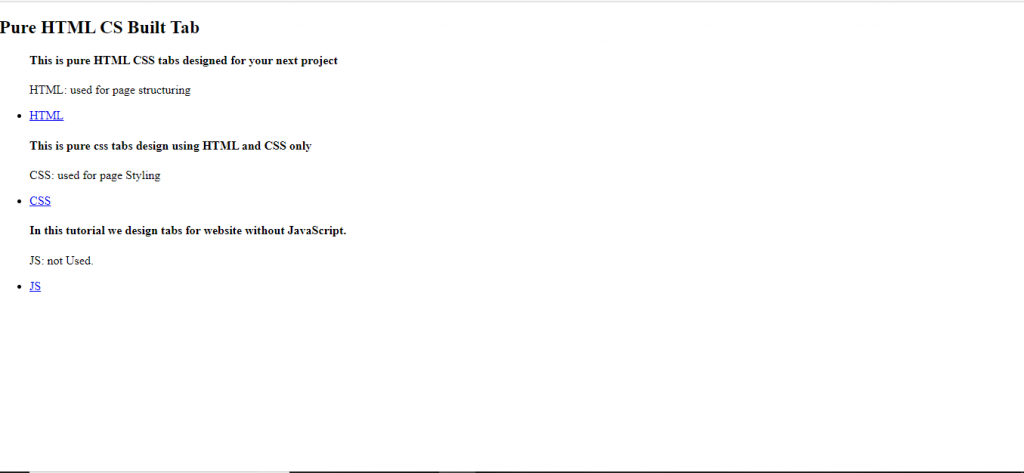
First of all, lets build a simple tabs menu with simple HTML using lists.
<h2 class="header">Pure HTML CS Built Tab </h2>
<ul class="tab">
  <section id="html"><h4>This is pure HTML CSS tabs designed for your next project</h4>
    <p>HTML: used for page structuring</p>
  </section>
  <li><a href="#html">HTML</a></li>

  <section id="css"><h4>This is pure css tabs design using HTML and CSS only</h4>
    <p>CSS: used for page Styling</p>
  </section>
  <li><a href="#css">CSS</a></li>

  <section id="js"><h4>In this tutorial we design tabs for website without JavaScript.</h4><p>JS: not Used.</p></section>
  <li><a href="#js">JS</a></li>

</ul>
The section contains the the contents which will be displayed by each hypertext disguised as a menu tab. You might have notice the usage of section content before the hyperlink.We will understand this arrangement later in step 3. For now just get on with the flow.
This HTML simply renders a list structure on a web page with each item in a list providing a hyperlink.
Step 2: Adding Styles
As a result of the HTML, we can see a simple list has been rendered on the webpage. It’s just a skeleton right?? So Lets add some styles and make it look more daunting.
.tab{
  position:relative;
}

.tab li{
  float:left;
  overflow:hidden;
  list-style-type: none;
  display: block;
  margin-right:1px;
  left:70px;
  cursor: pointer;
  position: relative;
  color: WHITE;
  background: #6543F1;

}

.tab li a{
  display:block;
  text-decoration: none;
  color:white;
  padding:10px;
}

.tab section{
  z-index:0;
  width:70%;
  padding:5px;
  position: absolute;
  top:39px;
  left:110px;
  color: black;
  background: white;
  border-radius:0px 5px 5px 5px;
  box-shadow: 0px 2px 2px 0px grey;
}
Here, The positioning and pixel arrangements on the code above are simple adjustment done with trial and error experimentation. Here we selected the list item and gave it a beautiful background so as to remove the default look of the list. Lets face it, we don’t want that list style on our tabs menu, do we? Then we’ve removed the default styling of the anchor tag and added some padding for better UI. Coming towards the content section the most important property here is positioning and the z-index, rest are for designing a box like structure for each content.
The Use of z-index
Now lets discuss the importance of absolute positioning and z-index for our application. The absolute positioning allows us to position our section without any regards to the positioning of other sibling elements. We can stack elements on top of one another. Why do we want to that? That’s undesirable, right?? But we can use the z-index property to arrange the stacking order of the content and that’s what we want.
Let me clear it more easily. For instance, all three sections are stacked on the same position, Now changing the order of the stack we can show the section on top of others, as we desire.
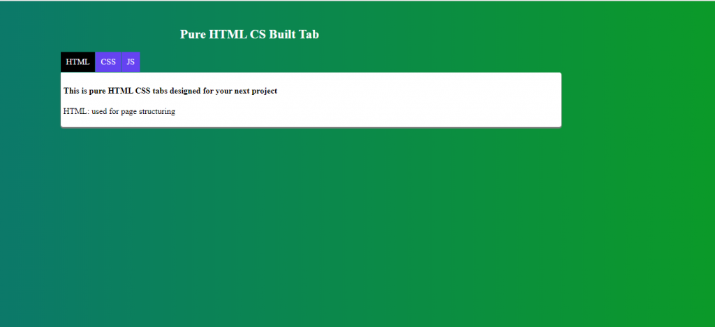
Here we can see the last content is being shown as all the other section contents are stacked beneath it. Well, we don’t want to display the last section when the page starts at the beginning. So lets change the order of the first section which includes the HTML content to stack on top of all the other sections.
.tab section:first-child{
  z-index:1;
}
Before the above code all the stack had z-index set to 0. Now with the above code we have set z-index of the first child of section which is the html section to 1 that now brings section on top of the stack.
Adding Hover Effect
Okay! That was a lot to understand. Now lets add hover effect which is pseudo class selector as mentioned earlier.
.tab li:hover{
  background-color:black;
}
Step 3: Adding the Tab Feature
Before explaining the code further, lets talk a bit about target. Whenever a URL on the page points to some other elements within the page using the id of the element followed by a # sign, we can use target pseudo-class selector to select the particular element. For example, in our list items we have a following anchor tag
<li><a href="#html">HTML</a><li>
Using target we can select an element with id “html” that means it selects the following element.
<section id="html"> <h4>This is pure HTML CSS tabs designed for your next project</h4> <p>HTML: used for page structuring</p></section>
Okay, I hope that’s clear. If not, the following code will
.tab section:target{
z-index:2;
margin:0;
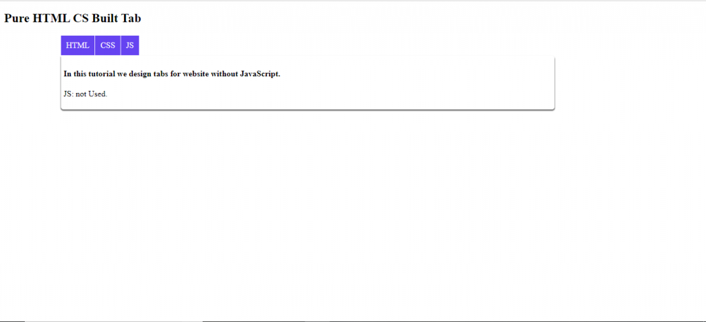
}In this CSS, the target pseudo-class is set to push the order of the selected section to top. Now try clicking each tab menus.
let’s trace back. Firstly, we set the z-index of all sections to 0. Then each selected section is ordered to appear at top of stack hiding other sections beneath it. The question of WHICH SECTION is answered by the target pseudo-class. The section which is pointed by the anchor tag is represented by the target pseudo-class once the hyper text is clicked and the represented section is displayed as a block.
With that done, We might want to highlight the tab being selected for that the following CSS is used.
Highlighting the Selected Tab
.tab section:target + li{

  background:black;

}
The “+” selector selects element just after the specified element.
Now once again lets trace back way up to step 1 where we’ve added section contents before the list items. That is because when by target selector lets say html section is selected we want to highlight the html tab. So by ordering section before the list item we can make use of “+” selector to select the list item for changing its background.
Adding Background with Linear-gradient
Okay! Hold on… we are just about to finish. Let’s add a final touch of beauty to our website.
html{
  height:100%;
}

body{
 background-image:linear-gradient(to right,#0C796A, #0B9A29);
 background-size:cover;
  background-repeat:no-repeat;
}

.header{
  color: White;
  margin-left:25%;
  margin-top:50px;
}
Phew!! That oughtta do it..
Viola! Our very own designed tabs menu User Interface just with HTML and pure CSS without js
One of the major flaw of this tab development is that making use of URL hashes makes random page jumps down to the element with the given id and that’s a bad experience and so kinda bad development process. So we’ve introduced another technique of designing and developing pure CSS tabs menu code without js below with examples of both HTML and CSS codes. But before that lets reveiw all the codes that we used for pure CSS tabs.
Pure CSS tabs Code using :target Selector
HTML Code:
 <h2 class="header">Pure HTML CS Built Tab </h2>
<ul class="tab">
  <section id="html"><h4>This is pure HTML CSS tabs designed for your next project</h4>
    <p>HTML: used for page structuring</p>
  </section>
  <li><a href="#html">HTML</a></li>

  <section id="css"><h4>This is pure css tabs design using HTML and CSS only</h4>
    <p>CSS: used for page Styling</p>
  </section>
  <li><a href="#css">CSS</a></li>

  <section id="js"><h4>In this tutorial we design tabs for website without JavaScript.</h4><p>JS: not Used.</p></section>
  <li><a href="#js">JS</a></li>

</ul>
CSS Code:
 html{
  height:100%;
}
body{
 background-image:linear-gradient(to right,#0C796A, #0B9A29);
 background-size:cover;
  background-repeat:no-repeat;
}
.header{
  color: White;
  margin-left:25%;
  margin-top:50px;
}

.tab{
  position:relative;
}
.tab li{
  float:left;
  overflow:hidden;
  list-style-type: none;
  display: block;
  margin-right:1px;
  left:70px;
  cursor: pointer;
  position: relative;
  color: WHITE;
  background: #6543F1;
}

.tab li a{

  display:block;
  text-decoration: none;
  color:white;
  padding:10px;
}

.tab section{
  z-index:0;
  width:70%;
  padding:5px;
  position: absolute;
  top:39px;
  left:110px;
  color: black;
  background: white;
  border-radius:0px 5px 5px 5px;
  box-shadow: 0px 2px 2px 0px grey;
}

.tab li:hover{
  background-color:black;
}

.tab section:first-child{
  z-index:1;
}

.tab section:target{
  z-index:2;
  margin:0;
}
.tab section:target + li{
  background:black;
}
Technique 2: Creating CSS Tabs Using Radio Button
The beauty of a radio button is its ability to be selected only once among the same group of radio buttons. We can exploit this feature to create a tab menu.
Step 1: Creating Radio Buttons
First of all, lets create a list of radio buttons. For these radios to act as a tab menu all the radio buttons need to be grouped under a single name.
<input type="radio" name="tabs” id="tab1" class="radioClass" checked />
This line creates a radio button and we have grouped the button under the name "tabs". The property checked sets the default checked position of the button. Remember, only one button under a same group name can be “checked” at the same time. id is set to be used for adding the labels of each button as below:
<label for="tab1">HTML</label>
While class is set to be used for further styling. To act as a tab menu each button should have a corresponding content values to be displayed. So the following div block is added to each list item.
<div class=”content”>

  <h4> HTML stands of HyperText Markup Language </h4>

</div>
Okay, having known all the basics of each items lets see how a collection of button is created in the following code snippet.
<h2 class=”header”>Pure HTML CSS Built Tab </h2>
<ul class=”tabs”>
<li class=”tab”>
<input class=”radioClass” type=”radio” name=”tabs” checked id=”tab1″ />
<label for=”tab1″>HTML</label>
<div class=”content”>
<h4>HTML stands of HyperText Markup Language</h4>
<p>Used for page structuring</p>
</div>
</li>
<li class=”tab”>
<input class=”radioClass” type=”radio” name=”tabs” id=”tab2″ />
<label for=”tab2″>CSS</label>
<div class=”content”>
<h4>CSSstands for Cascading Style Sheets</h4>
<p>Used for page styling</p>
</div>
</li>
<li class=”tab”>
<input class=”radioClass” type=”radio” name=”tabs” id=”tab3″ />
<label for=”tab3″>JavaScript</label>
<div class=”content”>
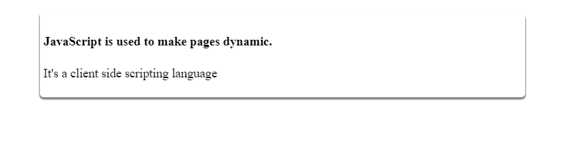
<h4>JavaScript is used to make pages dynamic.</h4>
<p>It’s a client side scripting language</p>
</div>
</li>
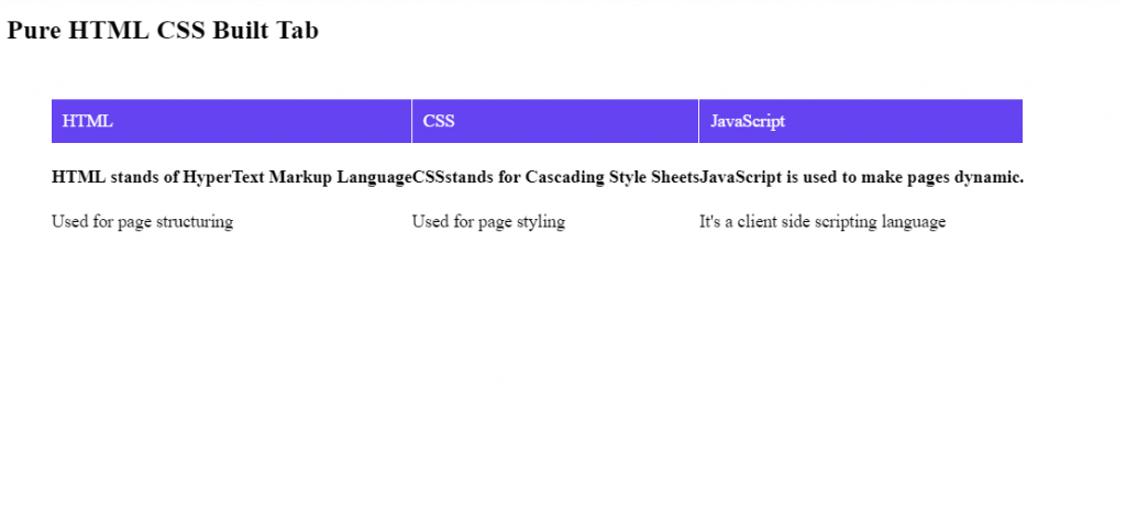
</ul>This HTML simply renders a radio button with its label and corresponding contents.
Step 2: Adding CSS Styles
First of all lets arrange the items horizontally, we do this by using the float property with value left. Hidden overflow is just a precaution for now to hide the contents exceeding the element’s block.
.tabs .tab{
   margin-top:28px;
   float: left;
   overflow: hidden;
}
Then the following lines of code is used for absolute positioning of the radio button and styling the label.
.tabs .tab .radioClass{
    position: absolute;
}

.tabs .tab label {
    display: block;
    margin-right:1px;
    padding: 10px;
    cursor: pointer;
    position: relative;
    color: WHITE;
    background: #6543F1;
}
Hiding and Stacking the Contents
The use of absolute positioning is to overlap the contents of each buttons and stack them together at the same position. So that we can revoke each content to appear at the same position.
.tabs .content {
    width:100%;
    padding:5px;
    position: absolute;
    top: 58px;
    left:48px;
    color: WHITE;
    background: BLACK;
    display:none;
}
This styling overlaps contents at the position specified and sets the display to none. So that we can display individual content by checking its corresponding radio button.
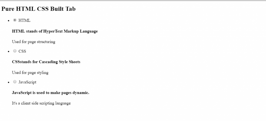
The CSS property border and border-radius is set to create a box modal like the above. However since we have set display to none, the content disappears from the page. Try removing the display:none line, You will see that the last content given on the html structure will only be visible. This is because all the other previous content were stacked beneath this content.
Highlighting the Selected Tab
Now with this done, lets highlight the menu to show the selection of the tab. Up until now, try clicking on each tab you can see no any affects but in background the radio button is being clicked simultaneously. As a User Interface designer, you should consider showing these changes effectively.
.tabs>.tab .radioClass:checked + label {
    background: WHITE;
    color: BLACK;
}
In the above CSS, “+” and “>” selectors have been used. “+” selector selects the elements just after the specified element while “>” selector is used to select the direct children inside the specified elements. The given CSS sets the background and color of the label whose corresponding button has been checked. Don’t trust me?? Check it by clicking each menu tab.
Displaying the Content
Okay let’s go further. Still the content of the checked button doesn’t display. So we need to add the following CSS
.tabs>.tab .radioClass:checked ~ .content {

   display:block;

}
Up until this point we have developed a basic tab featured application. But the interface looks crappy. So lets add a beautiful background making use of gradient.
Adding background with gradient
html{
  height:100%;
}

body{
 background-image:linear-gradient(to right,#0C796A, #0B9A29);
 background-size:cover;
 background-repeat:no-repeat;
}
Now we can see that the menu tab and content box looks like a disjoint items. Lets join them together.
.header{
  color: White;
  margin-left:25%;
  margin-top:50px;
}

.tabs{
  display:block;
  margin-left:78px;
}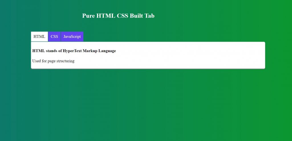
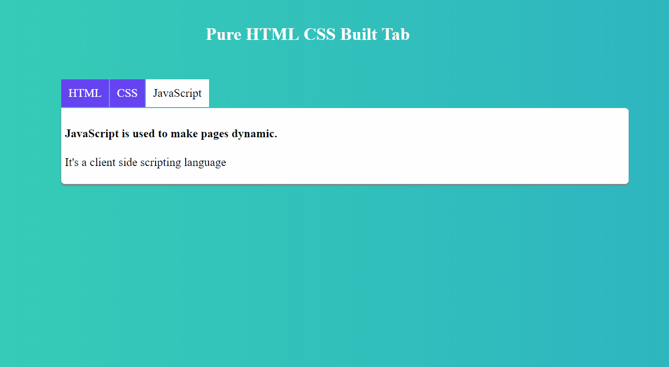
Wow! Seems cool! Now look at the final design of tabs you just developed by playing with raw HTML and CSS. Try tweaking some CSS if you want. You can create a better design, yet still. 😉
The entire pure CSS tabs code developed with this technique without JS:
HTML Tabs Code Snippet:
<h2 class="header">Pure HTML CSS Built Tab </h2>
<ul class="tabs">

    <li class="tab">
        <input class="radioClass" type="radio" name="tabs" checked id="tab1" />
        <label for="tab1">HTML</label>
        <div class="content">
          <h4>This is pure HTML CSS tabs designed for your next project</h4>
          <p>HTML:used for structuring</p>

        </div>
    </li>

    <li class="tab">
      <input class="radioClass" type="radio" name="tabs" id="tab2" />
      <label for="tab2">CSS</label>
      <div  class="content">
          <h4>This is pure css tabs design using HTML and CSS only</h4>
        <p>CSS:Used for page styling</p>

       </div>
    </li>

     <li class="tab">
      <input class="radioClass" type="radio" name="tabs" id="tab3" />
      <label for="tab3">JavaScript</label>
      <div  class="content">
          <h4>In this tutorial we design tabs for website without JavaScript. </h4>
        <p>JS: Not used</p>

      </div>
    </li>

  </ul>
CSS Tabs Code:
.tabs .tab{
   margin-top:28px;
   float: left;
   overflow: hidden;
}
.tabs .tab .radioClass{
    position: absolute;

}
.tabs .tab label {
    display: block;
    margin-right:1px;
    padding: 10px;
    cursor: pointer;
    position: relative;
    color: WHITE;
    background: #6543F1;
}
.tabs .content {
    width:70%;
    display:none;
    padding:5px;
    position: absolute;
    top: 164px;
    left:126px;
    color: black;
    background: white;
    border-radius:0px 5px 5px 5px;
    box-shadow: 0px 2px 2px 0px grey;
}
.tabs>.tab .radioClass:checked + label {
    background: WHITE;
    color: BLACK;
}
.tabs>.tab .radioClass:checked ~ .content {
   display:block;
}
html{
  height:100%;
}
body{
 background-image:linear-gradient(to right,#0C796A, #0B9A29);
 background-size:cover;
  background-repeat:no-repeat;
}
.header{
  color: White;
  margin-left:25%;
  margin-top:50px;
}
.tabs{
  display:block;
  margin-left:78px;
}
Conclusion
Finally, we have managed to design and develop tabs menu functionality with lightweight HTML and CSS without JS. We looked into simple pure CSS tabs code developed with two techniques. From here, You can go on add more tabs just by adding more div in html structure. From here you can go on adding animation affects on the same code. Try using Jquery, bootstrap and Javascript for better dynamic design because let’s face it CSS is for styling and using it for tabs is a tricky use and bit hacky.