Image shadow effect has always been a cool way to get realistic and 3d website layout that is just few CSS codes away. Yes, just few CSS codes only no need of JavaScript. However, as complex as jQuery may look it adds extra dynamics with CSS and same is case for examples of image drop shadow that we have here. Therefore some examples may be left with JavaScript in addition to CSS to get amazing box shadow effect for png and other format image in bootstrap as well as many other frameworks. Its just pure CSS and classical JavaScript code that’s a copy paste away from making a great layout.
So, we described a paragraph on what we are going to deal today but why should you continue with us? Its because for years now we have been dealing with resources for web designers and developers covering vast array of needs. All of our articles were created with only one thing in mind and that is how to give best results for any web layout in present. And of course you may be in need of great image effect for you’re next project and your search engine led us to here. I will just summarize the benefit of using the shadow effect for your project in one sentence and that is it will get you stunning results.
12+ Image Shadow CSS Effect Examples with Source Code
So enough of introduction and other stuffs. You can expect to get a number of shadow effects in coming examples that maybe static or respond on hover. Each one to fulfill a number of needs. To name a few, proper image content management would façade all the implementations however to be specific it could be image gallery, product card layout and even a landing page design. So continue to find one for you.
Related
- CSS text shadow effect examples
- CSS box shadow code snippet
- Zoom image hover effect with CSS
- CSS hero image background
- 3D text CSS effects
Here’s the list of image shadow CSS effect examples with complete demo and source code which is free to just copy and paste in your application. Did you ever think getting a realistic layout for your project would be as easy as this?
1. Background Image Property Shadow
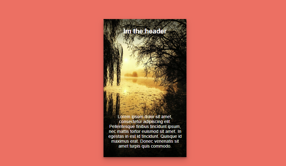
Here you’ll find the tutorial to get a 3d image concept for your front end website design. The example involves the use of png image on top of another image however the trick is use drop shadow for non overlapping area with css.
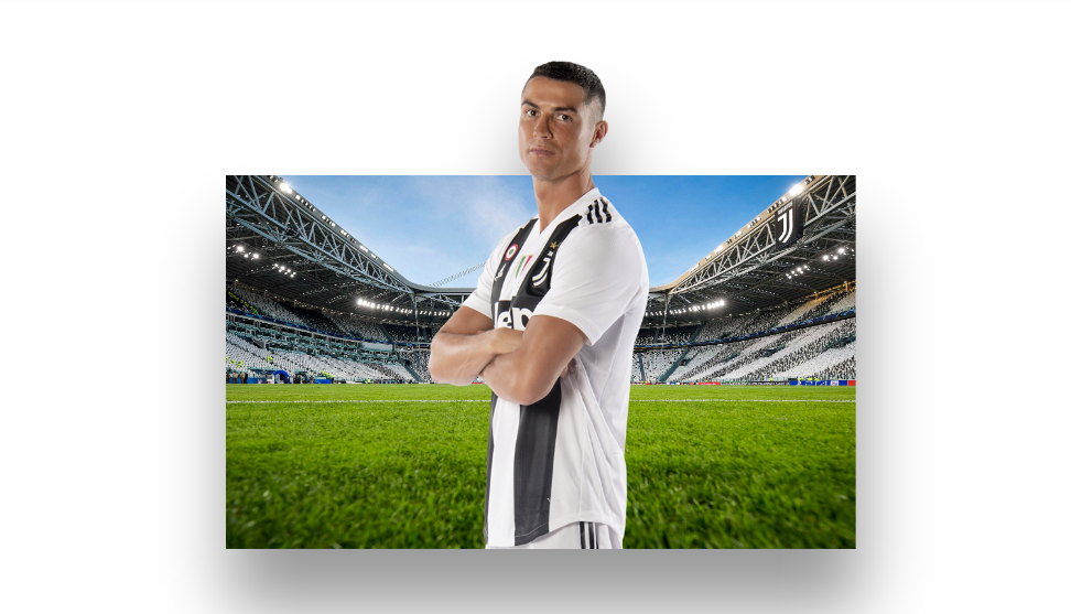
As you can see in the example, the background and the front image are of different height. So for the difference in image height that is the head of superstar Cristiano Ronaldo has a light shadow effect. Its the effect for not only the single image but for collection of both image. Hence resulting in 3d effect. It only requires few lines of html and css code to get this design and you can implement it for free from the tutorial link below.
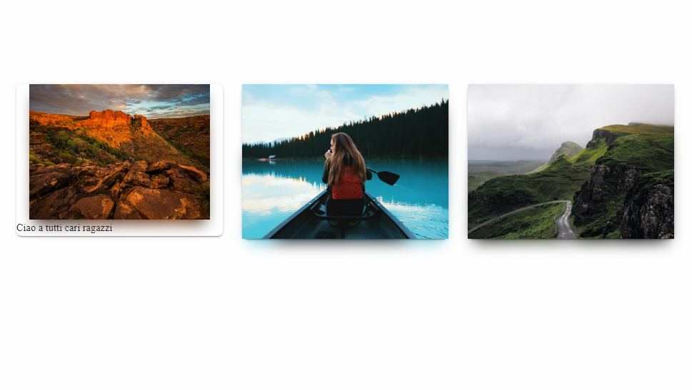
2. Card Shop
Here’s one of the example of interactive hover effect to drop additional shadow for the card layout. It enhances the product card layout for a beautiful ecommerce web site. Its not just shadow effect to learn from following image tutorial but a number of more additional css hover effect.
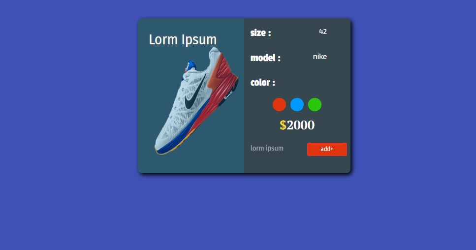
Starting from the beginning there’s already an image shadow effect, so just implementing the following source code for your bootstrap project will come with that. As you hover over the card you can see the shadow expanding to give the a lifting effect for an amazing website design. Other effects are encapsulated within the product card. To learn more head to the free tutorial on this material design from below.
3. UI Card with Image Shadow
Here’s the continuation to the css drop shadow effect for image card that you might be looking for your bootstrap project. Not a product card like before but more like a advertising of debit card or even amazing way to present the content.
Looking at the source code its the magic of html and css that we’re getting in the form of image shadow. The effect is very simple. While we have seen the component on website user interface lift up on hover, the designer and developer often left with confusion what to do with the box shadow. Here we have the solution in form of shadow rising up in the same manner as its parent component.
4. Blurred Image Shadow
A good user interface design in a website leads to good user experience. A realistic design is one of the trick and so is this image shadow. Its because the shadow for the box is unequally distributed from left to right and top to bottom.
With css the author can has achieved the blurry shadow for the image layout a bit more on one side and a bit less on another as a decorative bootstrap component. Therefore, giving the impression that its an actual lighting effect that we are getting.
5. Simple Gradient Card
In this css example we have a thin shadow effect around the image content layout that differentiates it from background. All of the magic comes from the box-shadow property where the designers need to define the dimension.
The image embedded inside the image is powerful depicting of the message. Add shadow on top of that and we get beautiful design to work along that without much effort gives a different dynamics to the website. To get this frontend component you can directly implement the source code or try something similar from link below.
6. iOS shadow effect with React
In many cases CSS does the trick but with JavaScript it can be taken to next level. As an example for that we have a layout similar to iOS. The square image layout lifts up as hover effect that extends the shadow border.
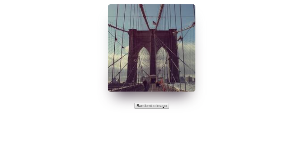
Its not just lifting of image on hover. The lifting effect can be seen more for upper part of the image with lower part being somewhat confined. This one is very popular and common box shadow effect that couldn’t be left out. As a matter of fact we have a collection on such responsive effect. Here we have the option to test the effect with a number of images. So give this tutorial a try for yourself.
7. Images with Dynamic Shadow
The following code snippet provides the access dynamic range of pure css image shadow effect. These effects are suitable to get beautiful design for image showcase. Whether that be for focus on a single image or collection of image designers need to give a try at this.
So the different kind of shadow effect that we can observe here are one with frame and other are normal kinds we have seen in a number of examples. Image box with shadow on two sides mostly left and bottom and another border around the entire layout is summarization of the achieved effect here.
8. CSS3 Floating Drop Shadow
Its unlike other examples we have seen by now on css shadow image for bootstrap. It is because its not a complete polygon shaped image layout. Here we have a png image with shadow on its drop with css. To be exact its a camera along with shadow to give a 3d float effect.
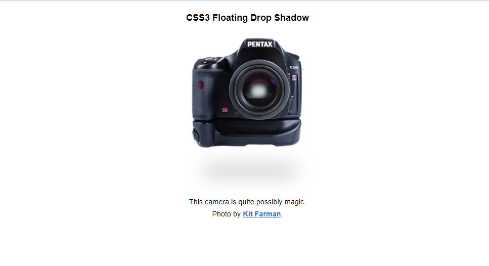
The shadow effect adds to the amazing initial layout while hover effect of expanding is an interactive feature to impress the users. Therefore, it makes a good component for ecommerce product layout without any boundary.
9. Cards Component Flexbox and Box Shadow
One way to indicate the boundary layout for contents is noticeable border and the other is light shadow effect such as this. What makes this border more effective is its ability to get a 3d floating effect. The trick remains in implementing the shadow only on left and right side of the box. On top of that the shadow is not in same vertical level but just few pixels below just like realistic shadow effects are.
You know where to look for the source code on this realistic and free user interface layout. Its an effective content management layout therefore can come in use for huge number of website design.
10. CSS Filter – Drop-Shadow
Its no less of an image editor that we have in the form of drop shadow css effect. With the slider available users can set the size of shadow. More than a shadow, I would call it a light blockage element since the layout is dark and its white layer that we are getting as shadow. Therefore the image layer is blocking the source of light rather than getting a complete shadow effect.
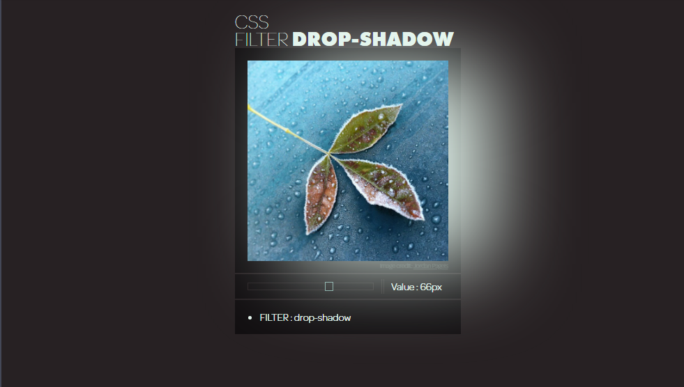
Nevertheless of the effect its a cool editing option for the users. Currently the box layout offers the image transition to right side however depending on needs it could be even to left with modification on source code. A png image and the drop shadow effect would add the enlightening effect with css within the same layout.
11. Box Shadow Hover CSS3
Here’s another example on ecommerce product section design for developers. As you can see it looks like the product are just present as a png image with no initial css drop shadow effect. However, the shadow appears for the entire product card on hover to indicate the current selection. This creates a lifting effect for amazing user experience.
This image shadow effect makes the bootstrap web site layout beautiful and clean with no unwanted border while efficient navigation option. Frontend designers must be looking for such user interface to implement and here’s the free resources for them.
12. iOS 10 Style Shadow With CSS and JavaScript
Here’s the second example on iOS image layout and I think web designer and developer will be looking to implement this for a number of different platform and framework like bootstrap. Why is that? Its because we have a highly interactive 3d image layout that not only gives shadow on hover effect but creates a dynamic perspective view.
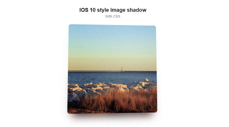
The drop shadow for the image is always present as a layer that is some distance apart from main box layer. It is achieved by rendering the drop shadow for image on left, right and bottom of box area. Besides that the shinny effect that image includes on hover while tilting is another attractive material design.
13. Background Image Gradient Drop Shadow
Here’s a image border that’s not a regular rectangle or square. Its a parallelogram that might be the transparent window to see the hidden background. The gradient layer on top of the image gives it a decent look. However, without the shadow effect for the image layout it would look as if its missing the magic.
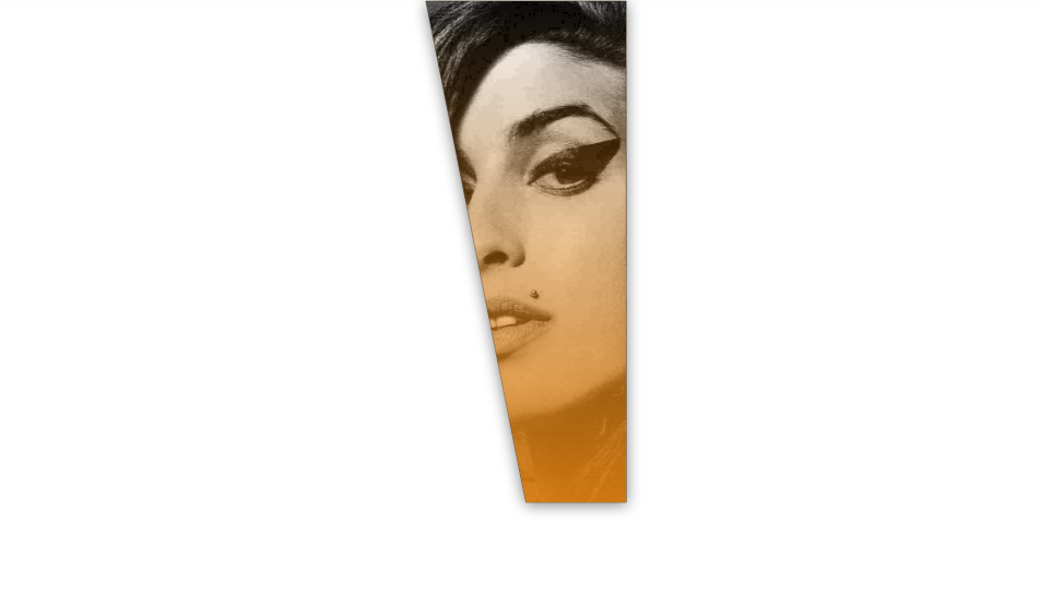
Although its a single component that we have for this example but a collection of such component can serve the need of a hero image for website. This makes the website design attractive with message delivery using image and text layout.
Conclusion
Hence we have reached at the end of today’s article. Summing up the things we saw, shadow effect adds a new dynamics to the website layout. Your website might still be functional and be amazing at the same time but shadow effect is just a tiny piece of code that not only gives a better user interface but also seems to enhance the user experience. So just a coupe of additional minutes to your designing and development time and see what the shadow effect does for your amazing project.