
So you have done everything well from marketing to good website layout and landed a number of clients or users that are ready to buy products from your site. However, there’s plenty of things still left. Until the deal hasn’t been finalized there will always be a number of things still left. For the most of the part the final few steps involve finalization of deals or payment. When there’s money involved there’s no room for any error that you can afford. Simple miss or doubt and all effort’s to vein. For the very same reason we thought of writing this article on checkout forms. You might be well familiar with css checkout form if you ever have tried to purchase via credit card on woocommerce site. Most of the time implementation is for same sector and we have a number of example on bootstrap checkout form to show.
When you hear about checkout its invoice, bills and payment options that strikes on the mind. The best approach involves use of credit card like layout and don’t worry on that because we have plenty to offer that today. However there are also alternative to credit card checkout form that are simple and only takes few minute for designing. Regardless of the design you choose, make sure you look professional along with security measures properly implemented. Once you loose a customer due to this issue, he isn’t coming back for sure.
20+ Best Free Checkout Forms Code with HTML, CSS and JavaScript For Designer
There are a number of ways to gain trust and improve the user experience when it comes to checkout process. As we said regardless of design, security should be the prime concern. Besides that you need to consider how to optimize the process. This may involve inclusion of multiple steps or quick payment layout or even editing the cart as the payment is being prepared.
Related Post
- CSS subscription form design
- Beautiful CSS contact forms code examples
- React form component libraries
- HTML CSS sign up and registration form
So let’s check in to the examples on check out forms that you can easily create with html, css and javascript.
1. Modal Checkout Form
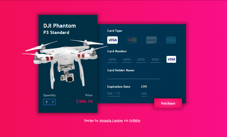
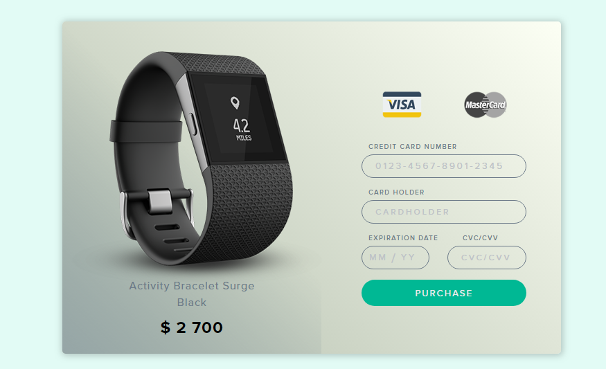
This following example of checkout form is the combination of price card and a credit card payment form. So this might be the only form you require as woocommerce checkout form. Its not just two type layout attached together but a number of interactive web components working together. Taking about the components individually its a product card first with 3d image of the product and option to select quantity of the product. You don’t need to do any math since final cost on that basis is automatically displayed. Select any type of card that you have and provide the credentials for final purchase simple as that.
2. Donut Payment
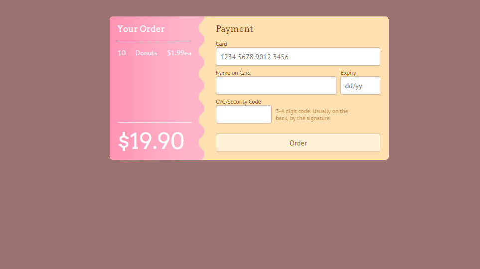
No its not the donut shaped payment form but rather one of the checkout forms for ordering donut online. Web designers do their best to give layout that is similar to real world. When imagining form people imagine a white plain paper with a number of fields. Breaking that stereotype we have a checkout css form that resembles the credit card layout. Its the combination of receipt and card information as the final checkout option. Therefore, you get to payment step only after finalizing the goods unlike previous example of checkout forms.
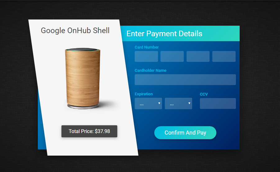
3. Single Product Checkout Css
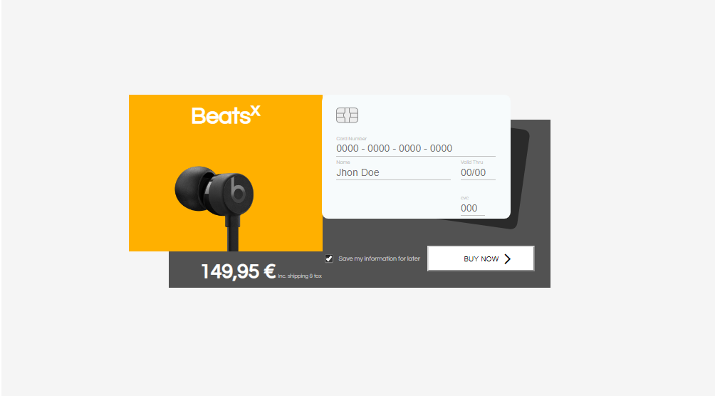
This bootstrap checkout form example works as a gem for single product. However purchasing of multiple products using similar layout requires some degree of modification. Don’t worry we have the code if you would like to try but for now its a credit card form, product image along with price and option to remember the purchase info is what we’re getting here.
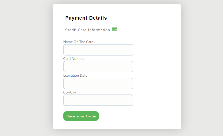
4. Credit Card
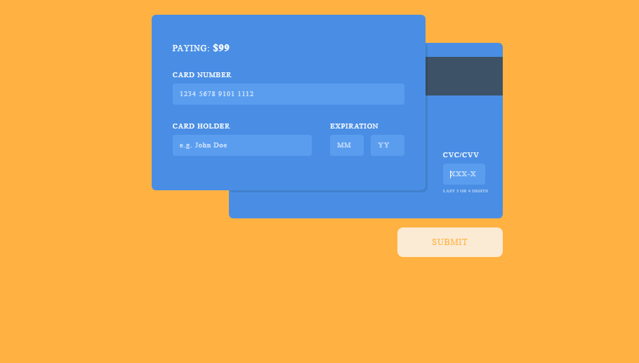
If you’re looking for more focus on payment forms option during checkout rather than product description then have a look at this credit card layout. You do give enough effort on product appearance from the beginning. So you don’t need to over optimize things by including product layout every time. Let’s go in a modular approach. So under that we deal with each requirement individually. This is the module for credit card payment. However, there exists some interrelation between each module like passing price from previous one to this one. Therefore, this layout just gets the total price information and after that its a stand alone component.
5. Credit Card Checkout
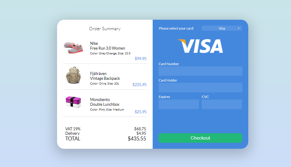
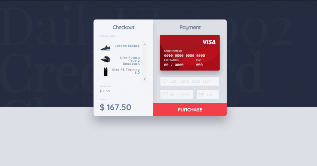
The one check out form that you might have been waiting for in this article. Summary of each and every product that you are ordering and multiple card payment system. Having said this bootstrap checkout form works for single as well as multiple product. Along that we get all the components of a proper invoice so you know how’s the total bill has been prepared. Its not just listing down of products if were under that impression. What you see in the woocommerce site for product details with image and main description is what you get in the checkout form.
6. Credit Card Checkout
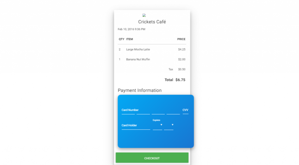
As a developer we know that for credit card payment its an external system that’s actually responsible for final payment. The exact representation for the same is having multiple components in checkout forms. In the following example we have a normal receipt for cafe and on top of that is container asking credit card information. We pay bills digitally nowadays so why should we have paper based receipt? Considering the same management system for restaurants and cafe came to rise and this layout is goes very well for such application.
7. Credit Card Checkout
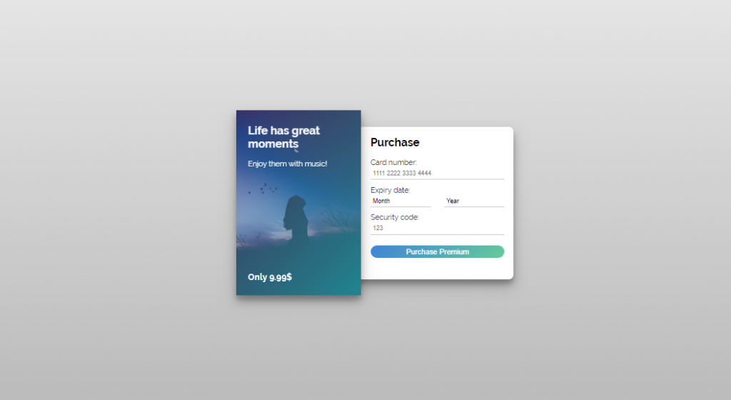
Offering music purchase from your site? They like the music and have even clicked on purchase button and now what? This is what’s next. The credit card checkout form along with css cover of the album. Its about the feeling of music not the price associated with it. Therefore we need more of such checkout forms that focus on what users are getting not on at what price they are getting.
8. Check out panel
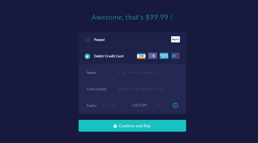
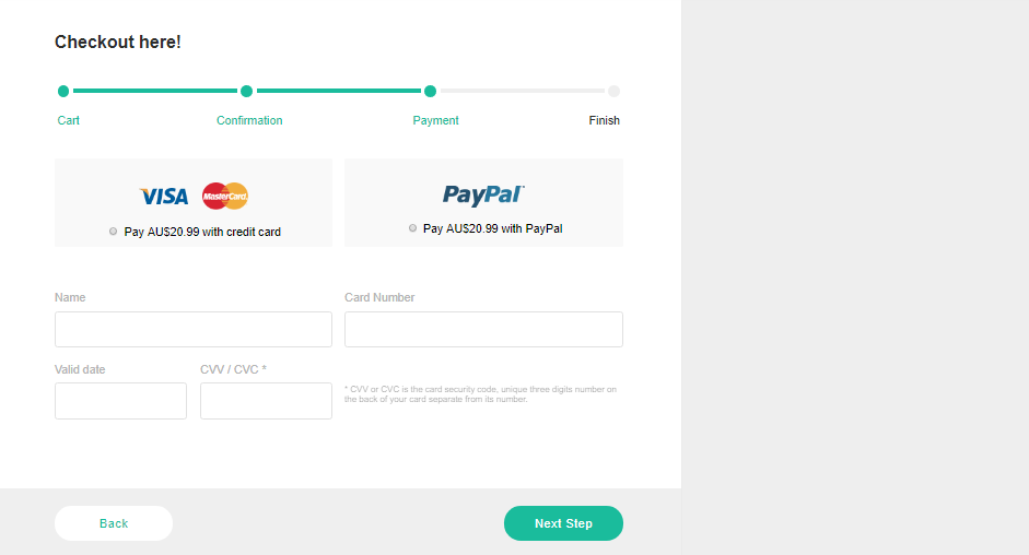
Checkout is the final step after exploring the products and confirming them. So this bootstrap layout represents the entire process in a series of steps with easy forward and back navigation option. We’re dealing with payment step in this article so the focus point remains on bootstrap checkout form. Since majority of information required to be provided for credit card payment is same its just the matter of selecting for service provider you’re sticking in this payment. So considering that we have a css radio button to specify credit card with other check form remains the same.
9. Credit Card Checkout
We gave an example on woocommerce checkout form just a while ago dealing with summary on all product to be purchased. However that example dealt with just enough products to fit the screen. So you maybe wondering what if there are more products than the size checkout forms have to offer. Scrollbar is a simple solution to that. Moreover the bootstrap checkout form consist of hover effect that shows the price of product only on hover. This is key to space optimization.
10. Credit Card Payment Form
For an accurate design of credit card payment checkout form, designers need to work on both front and back css layout. While most of the design involves all form components within a single screen its checkout forms such as these that gives the real world feeling. Therefore, having a checkout form layout such as this requires multiple faces of card with each facing dealing with its own data set. That means all visible data set are on front face while pins come under back face.
11. Credit Card Checkout
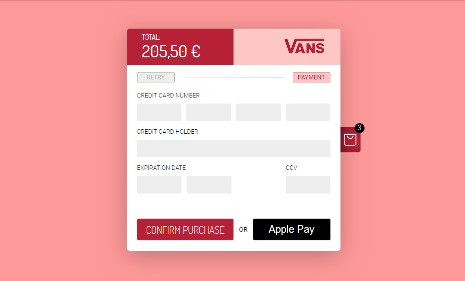
If you were thinking that to get information on purchasing products you need to either get a step back from checkout form or include all details within the same form then we’re here to prove you wrong. You don’t neither need to go a step back for hassle of moving front and back nor dedicate any initial space for those product information. So, if neither is the solution then how can we achieve that? It’s very simple. We apply the principle of toggle button here. Therefore a shopping cart button holds all the product information behind it with notification icon to indicate number of products.
12. Simple Payment Form use Bootstrap
What bootstrap can bring to your checkout form is simply amazing. This time as a subscription form. It went almost out of our mind that to gain customers the business owners also require to offer something for their loyalty. It can be discount card or coupon code. Make sure to include that in your checkout forms. Also be sure that you don’t mark the validation as required for that field or be ready to provide discount on every item. Surely it will gain many customers but you need to keep an eye on your pocket as well.
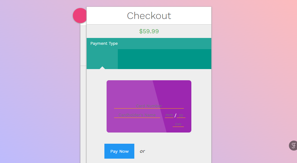
13. Credit Card Checkout Forms
Monochromatic checkout forms can bring multiple features to your bootstrap layout even though you may not notice it. We will show that with following example on checkout form. With monochromatic layout not only you offer a classic view but also easily indicate enabled and disabled functionality. Just look at the example of css checkout form below where multiple credit card are initially faded but as you pick one it gets colored. It operates same as the radio button but with better layout.
14. Credit Card Checkout Forms
A simple yet efficient checkout form is one where you get the option for payment as well as have one eye on product you’re purchasing. While by now its clear that you have a number of options that you can go for that, its about how much time you have at your disposal. Like for a quick solution we just compile things together this example on woocommerce checkout form a two layers place one after another. In simple words its the layout of payment form and a layer on product information placed on top of it.
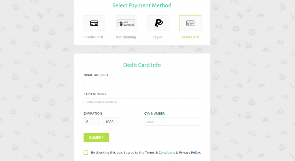
15. PAYMENT FORM WIDGET
Online payment doesn’t only mean payment from a credit or debit card only. With so many payment options available its better if you provide as many options possible. However, each option requires its own form because of unique requirements. I mean you can’t enter username and password for visa card not card number for paypal account. Therefore, we have the following example on checkout form with css layout from credit card to internet banking.
16. Credit Card Checkout Forms Example
We have seen the implementation of ribbons in previous article. Its not a compulsion but inclusion is definitely a noteworthy one.Even though the layout is sufficient to give impression of a credit card form, label to ask user input can be taken as a instruction. Moreover, privacy and security of the payment card is the primary requirement. So replacing the card number with some other character is one of the tricks to ensure that.
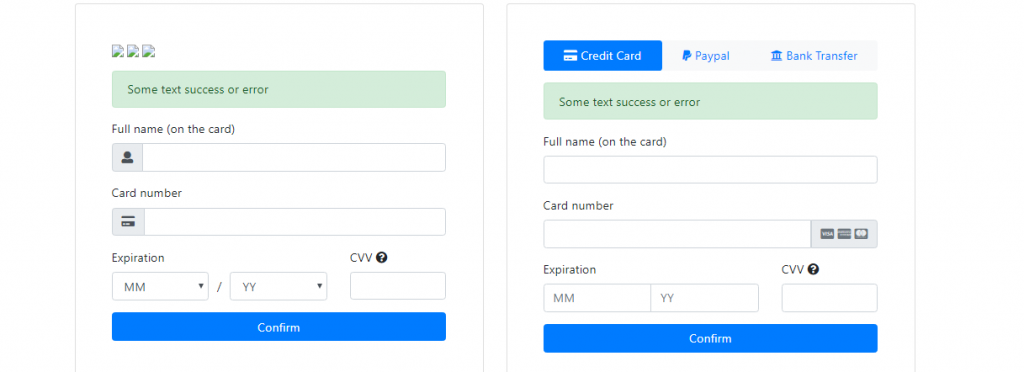
17. Payment form, credit card form block bootstrap4
Bootstrap checkout forms to deal with a number of payment options such as credit card, internet banking and digital wallet. Along with an attractive and informative bootstrap checkout form its necessary to able to deliver message on success or error. Entering all the information only to be redirected to another page saying you’ve entered wrong credential is something upsetting. Since the world is so familiar with AJAX, all the process can be carried out asynchronously.
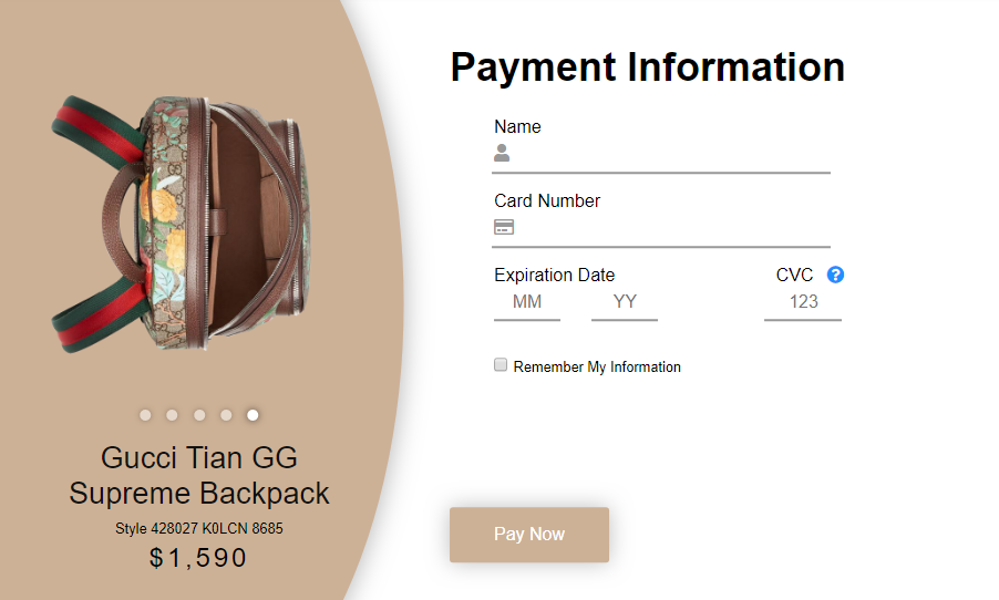
18. Gucci Backpack Checkout Forms
Here’s an alternative to showing multiple product information during checkout. How about taking the image slider from home page and adding it to the payment option? If its sounds good to you then following example of bootstrap checkout form is for you. Moreover, for frequent users its better to give them option to remember their information saving their time and earning you a client.
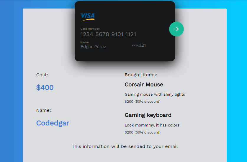
19. Creative Credit card form
The following layout is not just a credit card checkout form but also a css invoice of the product sales. Therefore with such layout of the checkout form it is not necessary to keep on asking for bills and invoice since they are automatically generated as you finalize the payment for products.
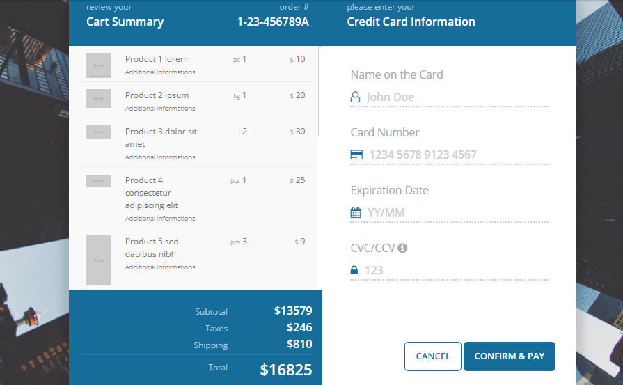
20. Checkout Forms with Payment Summary
Online payment system is on rise but it is still a challenge to win trust for a number of users. This checkout form is one of the effort to do so by allowing users to go through each details of the product before finalizing the payment. Don’t worry if its a month worth of groceries you are purchasing, this layout holds as many products as you can purchase. This is possible due to the scrollbar for cart summary. On top of that detail on bill amount makes the math easy for you.
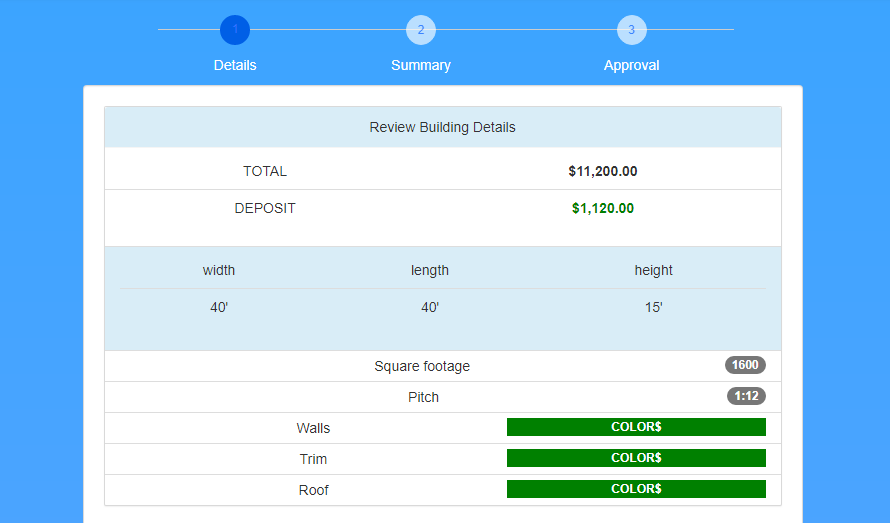
21. Multi Step Checkout Forms (HTML5 & CSS3)
Targeting more cautious users its best idea to offer the checkout in a number of steps. This allows the users to evaluate each step till they are fully satisfied. However the following example of checkout form is a single page process that can be navigated with click on button or by manually scrolling. There’s more to just product name and price in the detail category. So take your time and provide all the necessary details. Its up to users to be satisfied with the product by reviewing any number of times.
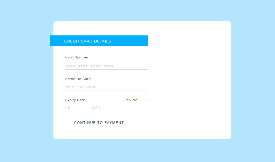
22. Credit Card Checkout Forms
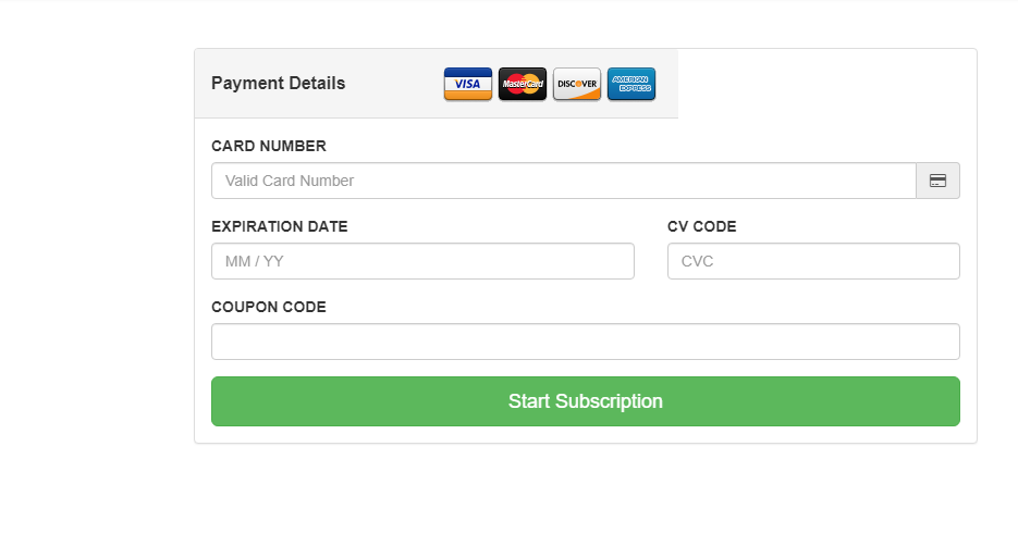
If you have been overwhelmed with rich checkout forms then we have got a basic checkout form to start with. No card layout no fancy product display just a simple payment details directly to the point. By no means its a bad layout just a simple one. So, as a designer if you’re not looking to spend so much of time on checkout form then for now you can go with this design. However, since we know how influential a graphically rich layout can be, we suggest you to go for upgrade later on.
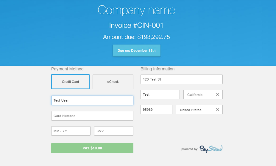
23. Embedded Checkout 2 Example
The checkout form is good enough in terms of layout so more than a client side layout, I would prefer this for internal staffs responsible for billing. Having said its a layout that will go well with any accounting and billing related application. You don’t even have to work on a separate invoice report since the information that you’re entering during checkout is the one that gets printed as invoice.
24. Checkout Forms Design
The final one we have on the examples of woocommerce checkout form is a prototype which can be taken as direction of our preference. For the initial phase the layout emphasizes on color more than the natural looks for information delivery. Moreover, its not just a credit card checkout form but also consists of information of products on you woocommerce site. Its not initially present nor its too far. The product information layer is just hidden behind the woocommerce payment checkout form.A click to display and another click to hide making efficient space utilization.
Conclusion
There’s a reason that not all shopping cart makes it beyond checkout process. Trust seems to be the main issue behind. We can’t just promise that improvement in one sector will completely change the game but it’s just a start. Its the combination of such improvements that will give the final result. So our intention was to make the checkout process least complicated process for your ecommerce site since its the difference between visit and sales. We do hope that we were able to simplify things with examples above.