I lost number of counts for our articles dealing with sticky menu, toggle sidebar button and a number of other CSS menu examples. Menu be it sidebar or header is one of the most important component in terms of navigation functionality and layout. Therefore, designers want to have a number of options to choose from. This one mostly deals with sidebar menu while containing one or two top headers that go along well.
With so many aspects to deal with in a website, menu layout is what holds all together. Its not even a question why one should have navigation menu. Not only in terms of SEO optimization but also to provide better user experience its a compulsory thing to consider.
Otherwise, good luck creating a document with every URL of the destined page and finding viewers who will even consider having a look.
Awesome CSS Sidebar Menus Examples with Source Code
So with all being said, we went across a number of available sidenav examples and summarized best ones for you. Moreover, all comes with code or option to download so you can learn by practicing.
Related
- Amazing CSS mobile menu examples
- React collapse components
- CSS sliding menu examples
- Amazing CSS hover effects
So let’s get started with over 20 sidebar examples containing sticky as well as toggle effects along with css code. You won’t go empty handed with this numerous collection of sidenav examples.
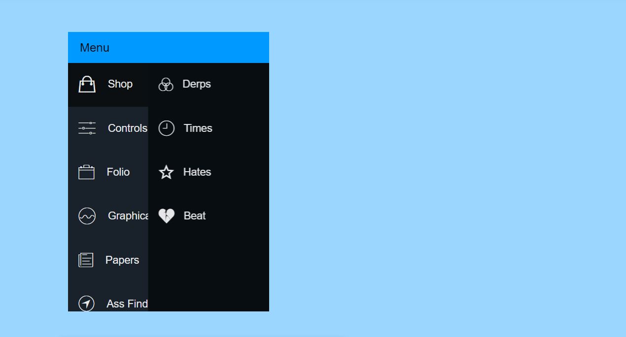
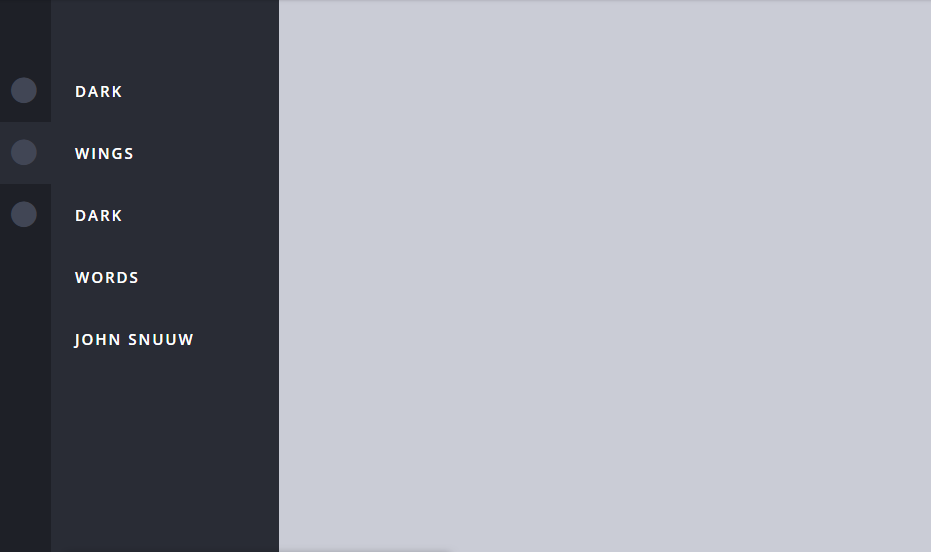
1. Purple Sidebar Menu
The sidebar doesn’t feel as if its a separate layer in the home page. This is because the sidebar aligns so perfectly with the actual content screen. Maybe the sidebar was exposed to sun just too long so it got tan. The hover effect gives the feeling of spotlight transitioning from one place to another. The dark background and faded sidebar elements lightning up mix up perfectly to give that feeling.
2. Pure CSS Fly In Sidebar Nav
A simple sidebar menu may not be a hard thing to include with few lines of CSS code. However, it becomes an issue when we need a nested menu. A number of sidenav examples deal with this situation but creating a responsive design. Alternatively, the sidebar menu may offer navigation by poping another container with child menu. Both may work fine but I personally feel this one stands out among all. The reason for this is a great animation effect and proper space utilization. Since the child menu appears jut from opposite side you may not even have to scroll to see menu components.
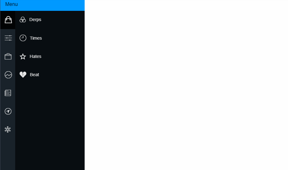
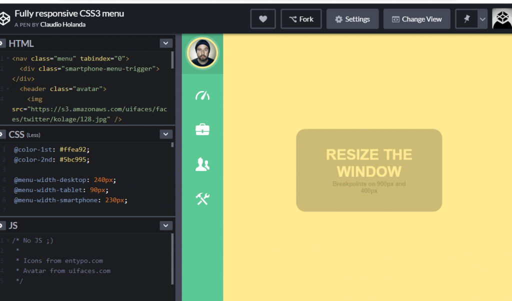
3. Fully responsive CSS3 menu
The responsive sidebar menu is a common sticky layout for any application that is a user based login system. By responsive it means that this sidebar will adjust according to the screen size. For example if the applications is accessed from desktop we will see sidebar component with both icon and label. Suppose now you’re accessing from a mobile then you will see a layout similar to below. This layout only includes the icons so that the main content container isn’t affected.
4. Side Sliding Menu CSS
We know icons are great way to convey message and provide navigation option. However, people may get close to the meaning but may have a little hard time deducing the exact meaning sometimes. So, having both icon and label is the best option to provide to users. However, you also need to consider space utilization specially for mobile apps. This example of sidebar solves the problem offering a sticky sidebar with icons and adding css effect to slide the label as you hover through it.
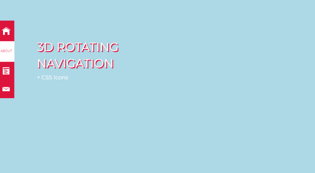
5. 3D Rotating Navigation
The next example is for you if you’re looking for a playful navigation option. The layout for this sidebar is that it is present in the form of rotatable blocks. The front face of the block shows the icon. So by default css style we see a block of sidebar menu containing icons for navigation option. As we said earlier about advantages of having combination of icon and label in sidenav examples, this one cleverly includes that. The adjacent block of the front face contains the label and it appears after hovering with a rotating effect.
6. Pure CSS3 Mega Vertical Dropdown Menu With Animation
By the looks of this sidebar menu it seems as if it can even fit as homepage while browsing from mobile. But a simple problem to do so because of its animation. It will require some space on both sides of the screen. Therefore, you might have to call it a middle bar navigation rather than sidebar menu.
So, talking about animation there are two actually three components on each block of sidebar. On top there’s icon and label while on bottom we have subtitle. While hovering we see top component appear from one side and bottom from another side. Hence websites with such navigation option in sidebar menu gives the impression of quick service to its users.
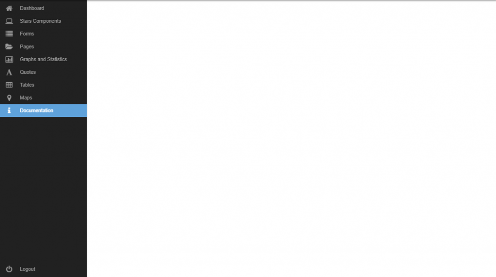
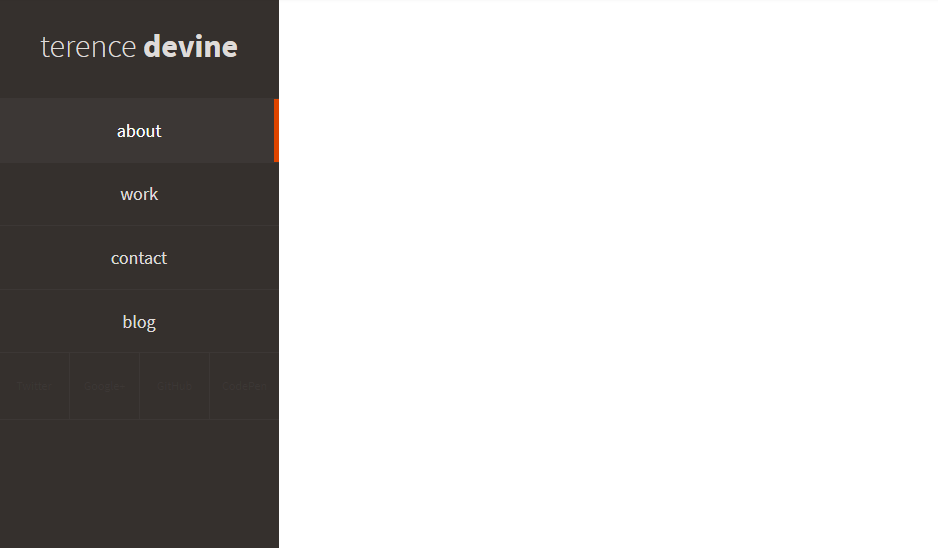
7. Sidebar template
I am still so thankful to bootstrap and its contributors who created some amazing templates ready to go for any web applications. During my course days, our primarily focus used to be on backend development because bootstrap has the front end covered for us. Although, our first few applications wasn’t much with maybe zero css code, bootstrap made it look amazing with professional like sidebar components for navigation. An example of such css sidebar menu is below.
8. Sidebar Menu Hover Show/Hide CSS
This example is similar to the sidebar slider one that we just discussed. So, the effect is fairly simple with a sticky sidebar containing only icons initially along with css effect to extend navigation option on hover. While sliding the container its width becomes wider making space for labels to show up. Take the cursor away and the sidebar restores to its original form.
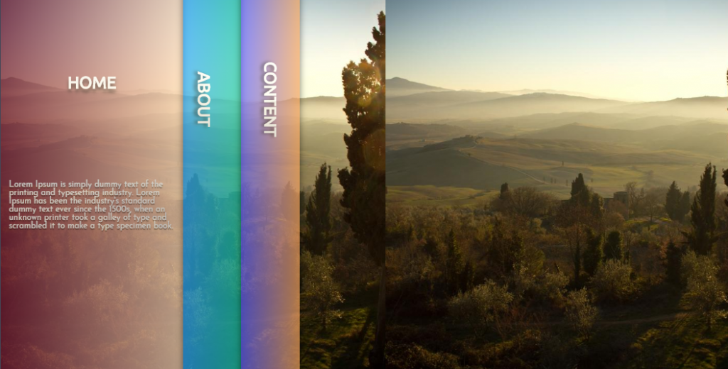
9. Card stack menu
No words, let’s just admire the beauty of this web component. All related stakeholders of tourism industry or nature related websites must take a look at this beautiful layout and sidebar menu. It will definitely create a good first impression on viewers. Unlike many examples of sidenav that we have seen that are for administration authorities, this one is specifically designed for client side or website view. The transparent and colorful sidebar doesn’t even effect the actual content. Therefore, you wouldn’t mind it stretching on hover for displaying details.
10. Pure CSS Side Menu
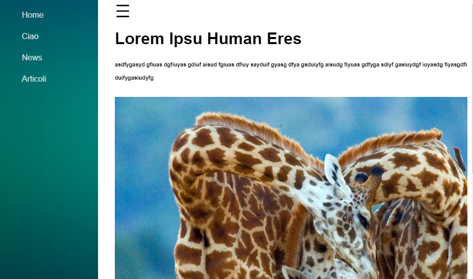
After a number of examples we know what to expect when we see an hamburger icon. Its not a function on itself however hides and shows the website components as per our necessity. So, we have the same concept of toggle sidebar menu designed with the help of CSS only. We know menu components are so important for website tour yet we are aware about their space consumption. Specially for mobile devices where you have so limited screen size. So, implementing a sidebar with the help of toggle button that appears when we need it and till then remains hidden might be the best solution.
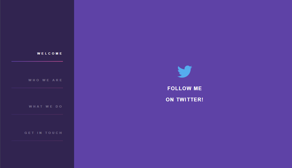
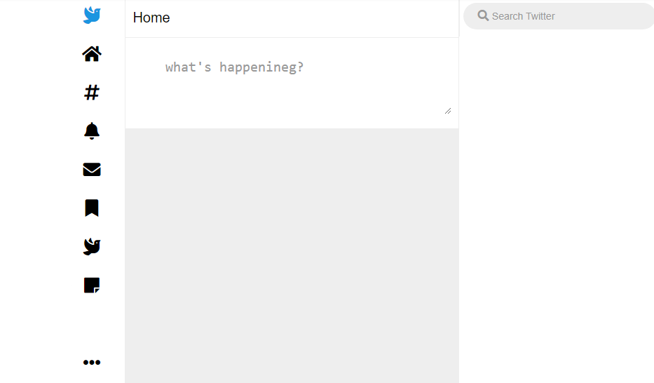
11. Twitter sidebar with css & html
If you have been inspired from twitter’s menu layout or looking for something similar for a content management project then have a look at this. The sidebar menu offers quick navigation to preferred actions with just a click while scrolling through. Since the main thing that users do in CMS is scroll through post, allowing them extra option while doing so is something that should always be on mind.
12. Reverse text color menu effects
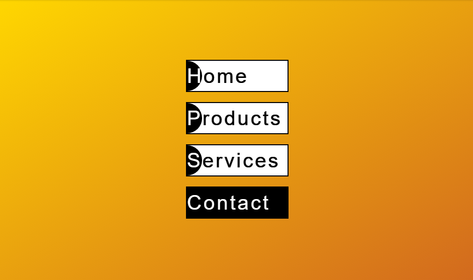
While most of us will consider the animation effect within the menu container only, this example includes the effect on background as well. As you hover each blocks you’ll see some effects on background. However, its not even the main attraction of this navigation option. While the initial layout is black text with white background and an arc at one side, hovering just reverses the effect. In other words, the arc slides across to cover block with black background while text adjusts by turning into white.
13. Navbar & sidebar
Applications with ton of offering can’t encapsulate everything within a single sidebar unless users are okay with scrolling up to a mile. Take the examples of Facebook or even WordPress editors itself, you have sidenav as well as navbar options. Combination of both is the best to deal with huge number of offerings. Moreover, the example shows inclusion of nested navigation menu within sidebar for additional options.
14. Sidebar Nav Animation
The actual contents adjusting according to change is appearance of sidebar is among good examples of responsive design with css. Rather than taking the spotlight of one of those components, the animation brings both to mutual understanding. Additional animation includes labels appearing in a sequence of steps on hover. Users can actually feel the animation with this effect.
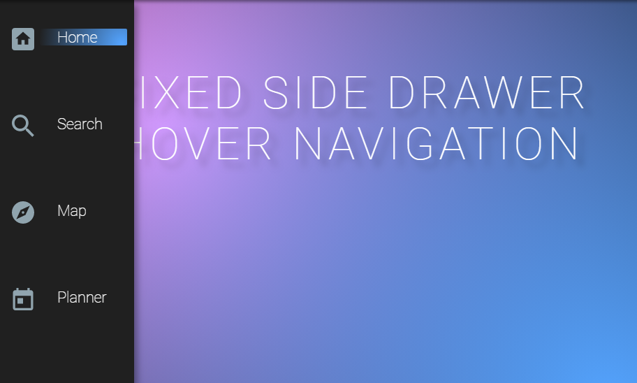
15. Fixed Hover Navigation
We are dealing with a number of sticky sidebar examples offering icon and label combination for navigation with css. Under the same category we have sidebar that stretches to show label while content remaining fixed. This means to hover action has effect on menu container only not the actual content. This is fairly important when you can’t afford to degrade content appearance. While making responsive design it may happen that the content images squeezes which doesn’t look good. So, if the content require to be immutable such fixed hover navigation are to go for.
16. Sidebar Thing
The sidebar that operates within its territory only. While we have seen a number of sidebar examples intervening in content area or stretching and squeezing its own space, this one operates without disturbing anyone. This is because we have main menu within the sidebar and its child menu appear from another side of the container without completely overlapping its parents.
17. Fixed nav hover effect
The sidebar comes with a toggle button like effect as a slider passes across the menu component. Along the slider we get an enlightened effect for the current selection along with a vertical colored indicator. If you think that’s all for the effect then its not. There’s also a reverse effect on same while moving on to next component as a means to show navigation.
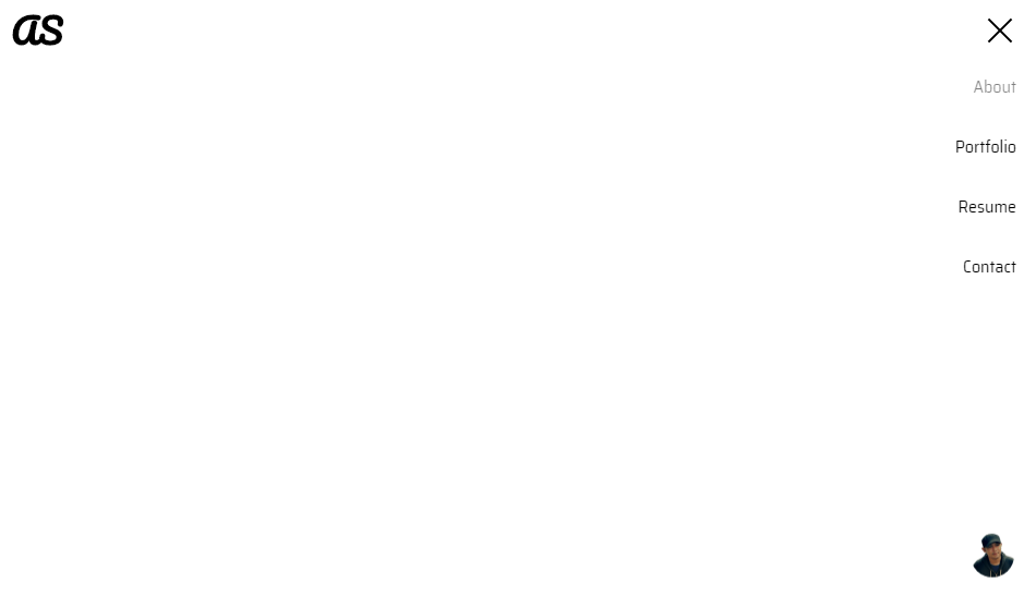
18. SideNav – Link On Focus
Most examples of sidebar comes with a background of its own with css to distinguish themselves from other content. Not this one though. Firstly, the sidebar is completely hidden with toggle button responsible for making it appear. Even after appearing, it doesn’t compromise the layout since it looks as if its a PNG format image just hanging around. In other words, its completely transparent and hovering on each component is distinguishable by slight fading effect.
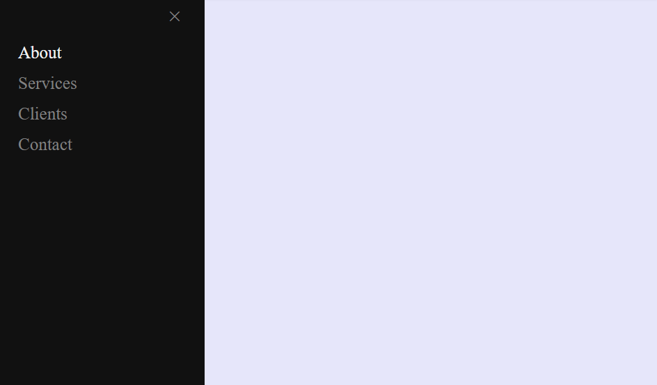
19. Collapsible Side Panel
The collapsible side panel is a joint effort of both css and javascript to come up with efficient sidebar menu. With that being said the sidebar slides across on click to toggle menu and can be collapsed using cancel button or alternatively clicking anywhere outside the container. You can include any additional styling and animation for menu component since the example is just about collapsible nature.
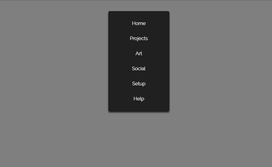
20. Sidebar Nav Menu
Let’s continue from exactly where we had left in the previous example. Similar collapsible sidebar menu along with styling of components. So, majority of the css feature was just explained a minute ago so this is an extended version of previous sidebar menu. Additional effect includes components to increase its font weight. This is in order to stand out among all other while being selected.
21. CSS only mirror like nav
Why wait for users to test and feel the animation effects when most of the automation is being done by system itself. This is the principle for next example of sidebar. The animation is like the component rotating itself while showing next face with same label. A sharp crossing straight line is the one responsible to create this effect that begins on hover. All these animation happen initially without involving any event action from users.
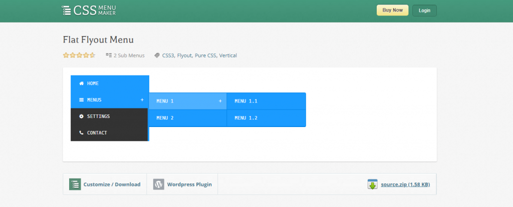
22. CSS Flat Flyout Menu
The flat flyout menu is a simple choice for navigation option where child menu appear in a separate container just adjacent to its parent. The advantage of such menu style is that it offers easy navigation along with tracking. However, disadvantage is that it keeps on adding the menu option as we go deep so background content is completely blocked. Therefore, the menu option is suitable where you don’t have much important content on background and just want to focus on easy navigation.
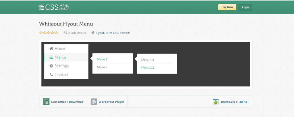
23. CSS Whiteout Flyout Menu
In last couple of examples of sidebar we will see sidenav components from same css content site. This sticky sidebar is similar to previous one initially however there are minor changes on css. Firstly its the background color that turned into white and second is link up between parent and child container. While in previous one parent and child containers were attached, here they are some distance apart. However, pointed edge shows to parent child relation in addition to colored label for easy navigation tracking.
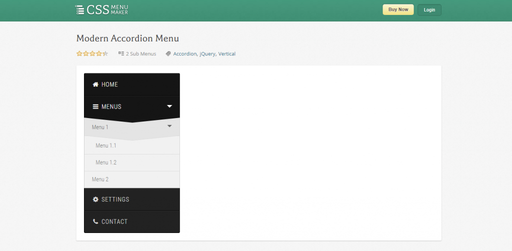
24. Modern Accordion Menu
About there but quite not yet. The last one on the examples of sticky sidebar menu for sidenav component brings us to popular css menu layout. The navigation sidebar menu includes the css transition effect. Because of this the menu components adjust as per extension and collapsing of any other component. There’s no external child sidenav container unlike previous examples. They appear within the same container with height adjustment as per need.
Conclusion
As we said in the beginning we lost the count for menu related articles. This is only a small addition to the collection. It was intended to help you choose navigation menu either sticky sidebar or with toggle css effect for you. However, with so much changes and trends going on you never know what new there is to try. If you feel you have such one in your bag then don’t forget to let us know. Feel free to comment below with what you have come up with or want from us. So, with promise to bring more such contents we conclude our article here.