
The degree of visibility of your contents often sets a benchmark to how extent your website design intrigues your visitors. Tabs allow you to organize your content but with accordion, you get an interactive and beautiful interface. How, you say? Well, we’re about to find out as you follow along this tutorial to build two examples of an accordion with pure CSS. Before that, lets understand what accordion menu is all about and how CSS blends in together with it to make your content presentable with multi-level vertical designs. Accordion presents the data grouped under a particular topic/ menu by stacking the menu and it’s relevant context (i.e. data) on top of one another. That definition might seem vague, so in this tutorial let’s build our own vertical accordion menu with HTML and CSS to get a clear understanding.
level vertical designs. Accordion presents the data grouped under a particular topic/ menu by stacking the menu and it’s relevant context (i.e. data) on top of one another. That definition might seem vague, so let’s build our own accordion menu with html and CSS to get a clear understanding.
Accordion menu helps make contents in a website more presentable and helps visitors to get a quick look on the topic they most prefer. The very intriguing feature of accordion is the ability to expand and collapse the content much like providing a hide and seek ability so that you don’t get entangled around the mess of disorganized contents.
HTML and CSS Accordion Menu Tutorial Examples
You will find various ways to manage your contents. You could opt for vertical tabs menu, horizontal tabs menu, icon tabs menu,.. well! I could go on to fill this entire tutorial. But here we are focusing on accordion and of course you can get varieties of design related to accordion menu and there are lots of ways to develop them by using Js, jquery, bootstrap etc.. However, In this tutorial we are keeping things simple as we build both vertical accordion menu with HTML and pure CSS.
Multi-Level Vertical Accordion Menu with HTML and Pure CSS
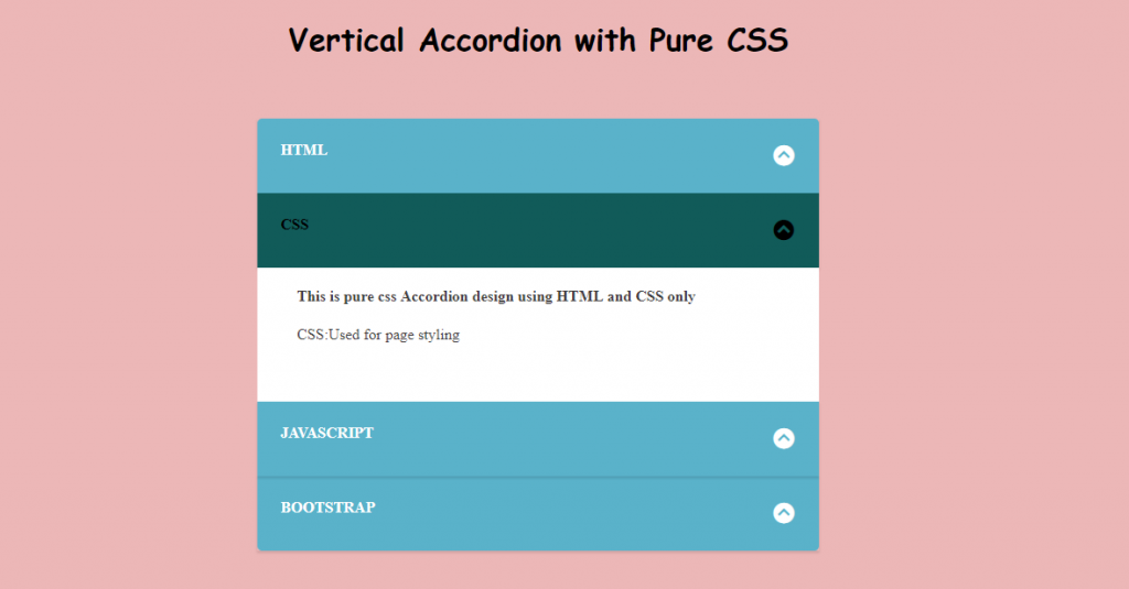
In this section of the tutorial we will build a multi-level vertical accordion menu. If you want to have a quick look on what we will be building. Here it is:
Step 1: Basic HTML
Okay! First things first. Lets code the basic HTML structure of our Accordion Menu.
<div class="accordion_menus">
  <div>
    <input id="accordion1" name="accordion_menus" type="radio">
    <label for="accordion1">HTMl</label>
    <section class="html">
        <h4>This is pure HTML and CSS Accordion Menu designed for your next project</h4>
        <p>HTML:used for structuring</p>
    </section>
</div>
The above code provides a simple radio button with its label and a section with some textual contents.
Radio Button: The Ultimate Hack
With just CSS toggling between menu is awry and usually not preferred way to go. But as we restricted our development with just HTML and CSS, the use of Radio button is to exploit its feature to act as the Accordion tab menu. Radio button has an interesting feature to allow toggling between the button under a same group. That means you can only select one button among several buttons grouped under a same name. Here in the above code we have grouped our radio button under the name:accordion_menus. Now as we move along, we keep on adding more button under the same name. So that only one button will be active at one time, which is exactly what we want on our accordion menu. The section encapsulates the content to be displayed under the selected menu.
Step 3: Adding More Buttons
Now as we have understood the basic structure. Lets multiply them by adding more radio buttons
<div>
          <input id="accordion2" name="accordion_menus" type="radio">
          <label for="accordion2">CSS</label>
          <section class="CSS">
           <h4>This is pure css Accordion  design using HTML and CSS only</h4>
           <p>CSS:Used for page styling</p>
          </section>
        </div>
        <div>
          <input id="accordion3" name="accordion_menus" type="radio">
          <label for="accordion3">JavaScript</label>
          <section class="js">
            <h4>In this tutorial we are designing Vertical Accordion for website without JavaScript. </h4>
        <p>JS: Not used</p>
          </section>
        </div>
        <div>
          <input id="accordion4" name="accordion_menus" type="radio">
          <label for="accordion4">Bootstrap</label>
          <section class="js">
             <h4>In this example we won't be using Bootstrap for Accordion development. </h4>
        <p>JS: Not used</p>
          </section>
        </div>
      </div>
In the above HTML, more buttons with similar structure as in step 1 has been added. These HTML radio button will be further developed with CSS to make it behave like an Accordion Menu. And just for extra look, lets add the following on top of the HTML body.
h2>Vertical Accordion with Pure CSS</h2>
This is pretty much what you should be expecting as of now. Don’t lose hope yet, mate. We’ve got a long way to sail.
Step 4: Removing The Default Look
You saw those round radio button right? Do we even want that? I don’t!
.accordion_menus input {
    display: none;
}
With above code, You got your page rid of those round structures ( I don’t know what they are called. :p ). Now lets add some colorful background and give the header a beautiful look.
body {
  background: #ecb7b7;
  padding: 5em;
}
h2{
  font-family: 'Dancing Script', cursive;
  font-size: 2em;
  text-align:center;
  margin-bottom:10vh;
}
The code is self-explanatory. I hope!
Step 5: Accordion Menu Look with Basic CSS
Okay! Let’s get on to change the radio button to make it look like an accordion Menu. We’ll be doing that by adding the following code:
.accordion_menus {
  background: #5ab2ca;
  width: 50%;
  margin: 10px auto 30px auto;
  border-radius: 5px;
  color: white;
}
?? Well, that didnt look so menu-like. But it did some add some touch of beauty. Remember, a beautiful design hides among the smallest detail of CSS. With that done, lets add some more CSS.
.accordion_menus label {
  display: block;
  height: 30px;
  text-transform: uppercase;
  cursor: pointer;
  font-weight: bold;
  padding: 1.5em 1.5em;
  box-shadow: 0 2px 2px rgba(0,0,0,0.1);
}
Told you beauty lies in the smallest detail. So, in this code also we’ve just experimented with some extra designs manipulating the cursor, height, texts and padding. And Can you see the lining on each labels which differentiates the labels from the content section?? That’s the charm of the box-shadow.
Step 6: Hiding The Content
Since the main feature of Accordion is its hide and show ability. To ensure this feature, first of all lets hide the content.
.accordion_menus section {
    background: white;
    color: #3f3c3c;;
    overflow: hidden;
    height: 0;
    padding-left: 3vw;
    transition:height 0.3s ease-in-out;
}
Hiding the content shouldn’t be a tricky concept in CSS. You’ve got some basic property/value pairs like opacity:0, display:none, z-index:-1 to go for. But here we’ve gone for setting the height to zero. Seems odd?? Well here is an explanation for you: As you click on the menu or in our case the radio button, we don’t just want the content to be displayed, we want to add some transition effect to the content appearance. With display you don’t get any transition effects. With opacity you just get a fade-in effect and same with z-index. Try experimenting! However later we can set the height to some desired value to show the expanding effect of the increasing height as we activate a particular menu.
Step 7: Displaying The Hidden Content
We hid the content in above code by simply setting height to zero. Now as we select particular accordion menu which, in our case, is just pure HTML radio buttons disguised with CSS, we want to display the corresponding content. So, the code follows:
.accordion_menus input:checked ~ section {
    height:140px;
}
When the input is checked, the sibling element section is selected with ~ selector then the height of that particular section is set to 140px.
Note: ~ selector selects the sibling element that are present after the element with which the selector is used. .a ~.b{}selects all the sibling elements of class b that are present after the elment a.
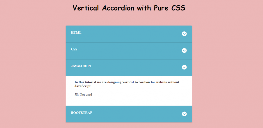
Step 8: Adding Drop down icon from CSS on Vertical Accordion Menu
For this tutorial, I’ve added icon from font-awesome. So, for that I have added the CDN link of the font-awesome CSS in head tag of HTML structure.
<link rel="stylesheet" href="https://maxcdn.bootstrapcdn.com/font-awesome/4.5.0/css/font-awesome.min.css">Then the drop down arrow is added with following lines of CSS code:
.accordion_menus label:after,.accordion_menus input:checked + label:hover:after {
  font-family: "FontAwesome";
  content: "\f13a";
  padding:2px 2px 2px 2px;
  font-size: 1.5em;
  float: right;
  transition: .3s all;
  transform: rotate(-180deg);
}
The above CSS uses ::after selector to add the content given in content property after the particular selected element which in our case is label. Since label represents the accordion menu in our tutorial, we’ve added the drop down icon by adding unicode of dropdown as provided by font-awesome as a content. The use of transform is for animation.
The second selector block is to show the constant effect even when hovered over a selected block.
If you’ve followed along then you should have got the above design. Though it looks daunting to look. We’ve yet to add some interactive aspects like hovering and highlighting. So…
Step 9: Adding Hover and Highlighting CSS Effect on Vertical Accordion Menu
.accordion_menus label:hover {
     background: #357E92;
}
The above CSS changes the background when hovered over label.
.accordion_menus input:checked + label{
  background: #115B59;
  color: black;
}
The above CSS changes the color and background of label when particular menu is selected, showing the highlighting effect.
Note: + selector selects the immediate next element that is present after the particular element.
.accordion_menus label:hover:after{
    color:white;
    transform: rotate(0deg);
}
The above code changes the drop down arrow to upward pointing arrow while hovering. Compare the above code with that of CSS in step 8 for better understanding.
Step 10: Adding Multi-Level Accordion Sub-Menu Vertically
Okay! We are already done with the main vertical accordion menu implementation with pure CSS and HTML. But to add some extra touch to the tutorial, I’ve added extra sub menu to go along. Okay Now add the following lines of code after the section element of class html.
<div class="accordion_menus">
          <input id="sub-accordion1" name="sub-accordion_menus1" type="checkbox">
          <label for="sub-accordion1">sub-Menu</label>
          <section>
            <h4>This is pure HTML and CSS Accordion Menu designed for your next project</h4>
            <p>sub-HTML1:used for structuring</p>
          </section>
          <input id="sub-accordion2" name="sub-accordion_menus1" type="checkbox">
          <label for="sub-accordion2">sub-Menu</label>
          <section>
            <h4>This is the sub-header of Accordion menu developed with pure CSS</h4>
            <p>sub-HTML2:used for structuring</p>
          </section>
    </div>
You can see that this sub-menu resembles the main menu, so that the CSS for the main menu could be implemented for the sub-heading also.
.accordion_menus .accordion_menus{
  display:none;
  width:100%;
  margin:0;
  padding:0;
  background: #f1f1f1;
  color: black;
}
.accordion_menus .accordion_menus label:after{
  color:Black;
}
.accordion_menus input:checked +label +section +.accordion_menus{
  display:block;
}
.accordion_menus .accordion_menus label:hover{
  background-color:grey;
}
.accordion_menus .accordion_menus input:checked +label{
  background-color: #AB9595
};
The above CSS are just to differentiate sub-heading from main heading. If you’ve gone through the tutorial thoroughly, then you can easily understand the above CSS code. If not, keep experimenting. After all its all about experimentation.
Complete Code
Finally in this tutorial, we have accomplished our goal to create multi-level vertical accordion menu. Below I’ve compiled all the above HTML and CSS codes that can be used directly.
HTML Code
<head>
<!--  font-awesome CDN for icon-->
  <link rel="stylesheet" href="https://maxcdn.bootstrapcdn.com/font-awesome/4.5.0/css/font-awesome.min.css">
</head>
<body>
<h2>Vertical Accordion with Pure CSS</h2>
 <div class="accordion_menus">
  <div>
    <input id="accordion1" name="accordion_menus" type="radio">
    <label for="accordion1">HTMl</label>
    <section class="html">
        <h4>This is pure HTML and CSS Accordion Menu designed for your next project</h4>
        <p>HTML:used for structuring</p>
    </section>

    <!-- ============================================================
                    Sub-heading HTML
    ==============================================================-->
    <div class="accordion_menus">
          <input id="sub-accordion1" name="sub-accordion_menus1" type="checkbox">
          <label for="sub-accordion1">sub-Menu</label>
          <section>
            <h4>This is pure HTML and CSS Accordion Menu designed for your next project</h4>
            <p>sub-HTML1:used for structuring</p>
          </section>
          <input id="sub-accordion2" name="sub-accordion_menus1" type="checkbox">
          <label for="sub-accordion2">sub-Menu</label>
          <section>
            <h4>This is the sub-header of Accordion menu developed with pure CSS</h4>
            <p>sub-HTML2:used for structuring</p>
          </section>
    </div>
    <!-- ============================================================-->

  </div>

        <div>
          <input id="accordion2" name="accordion_menus" type="radio">
          <label for="accordion2">CSS</label>
          <section class="CSS">
           <h4>This is pure css Accordion  design using HTML and CSS only</h4>
           <p>CSS:Used for page styling</p>
          </section>
        </div>
        <div>
          <input id="accordion3" name="accordion_menus" type="radio">
          <label for="accordion3">JavaScript</label>
          <section class="js">
            <h4>In this tutorial we are designing Vertical Accordion for website without JavaScript. </h4>
        <p>JS: Not used</p>
          </section>
        </div>
        <div>
          <input id="accordion4" name="accordion_menus" type="radio">
          <label for="accordion4">Bootstrap</label>
          <section class="js">
             <h4>In this example we won't be using Bootstrap for Accordion development. </h4>
        <p>JS: Not used</p>
          </section>
        </div>
      </div>
  </body>
CSS Code
/* ============================================================
                    Removing the default Radio button
==============================================================*/

.accordion_menus input {
    display: none;
}
/* ============================================================
                    Adding some beauty
==============================================================*/
body {
  background: #ecb7b7;
  padding: 5em;
}
h2{
  font-family: 'Dancing Script', cursive;
  font-size: 2em;
  text-align:center;
  margin-bottom:10vh;
}
.accordion_menus {
  background: #5ab2ca;
  width: 50%;
  margin: 10px auto 30px auto;
  border-radius: 5px;
  color: white;
}

.accordion_menus label {
  display: block;
  height: 30px;
  text-transform: uppercase;
  cursor: pointer;
  font-weight: bold;
  padding: 1.5em 1.5em;
  box-shadow: 0 2px 2px rgba(0,0,0,0.1);
}
/* ============================================================
                    Hiding the content section
==============================================================*/
.accordion_menus section {
    background: white;
    color: #3f3c3c;;
    overflow: hidden;
    padding-left: 3vw;
    height:0;
    transition:height 0.3s ease-in-out;
}
/* ============================================================
  Displaying the hidden cotent once button is selected/checked
==============================================================*/
.accordion_menus input:checked ~ section {
    height:140px;
}
/* ============================================================
                    Adding drop down icon
==============================================================*/

.accordion_menus label::after,.accordion_menus input:checked + label:hover:after {
  font-family: "FontAwesome";
  content: "\f13a";
  padding:2px 2px 2px 2px;
  font-size: 1.5em;
  float: right;
  transition: .3s all;
  transform: rotate(-180deg);
}
/* ============================================================
                   Hover effects
==============================================================*/
.accordion_menus label:hover {
     background: #357E92;
}
.accordion_menus input:checked + label{
  background: #115B59;
  color: black;
}

.accordion_menus label:hover:after{
    color:white;
    transform: rotate(0deg);
}


/* ============================================================
                    Sub-heading CSS
==============================================================*/
.accordion_menus .accordion_menus{
  display:none;
  width:100%;
  margin:0;
  padding:0;
  background: #f1f1f1;
  color: black;
}
.accordion_menus .accordion_menus label:after{
  color:Black;
}
.accordion_menus input:checked +label +section +.accordion_menus{
  display:block;
}
.accordion_menus .accordion_menus label:hover{
  background-color:grey;
}
.accordion_menus .accordion_menus input:checked +label{
  background-color: #AB9595
};
Conclusion
In this tutorial, we have built a simple example of multi-level vertical accordion menu making use of Radio button. The only problem that radio button had without Javascript implementation was to uncheck the button which made it difficult to collapse the expanded button as you may have noticed while selecting main menu of our accordion tabs. However In the sub-menu I ‘ve implemented checkbox approach which allows to both collapse and expand the menu, but this approach allowed multiple selection. So in this tutorial, That was the trade-off between these two while building vertical accordion.
Moving on.. you can go for the user :target pseudo class selectors as well to build tab features that can be used for the accordion or you can use more advanced approach with JS and Jquery.
Congrats! You held through. That’s it for now!