Menu is like a google map for any website and mobile applications. They are not a new thing and have been around for some time. Whether it be a visitor visiting your website or application first time or a million times; without proper navigation option they can get lost. You don’t want your user experience to be poor by a bad web roadway and also I believe you don’t want your web’s user interface to be like a busy traffic. Every web service targets optimized offers for their users. This maybe in terms of performance, reliability, memory management or other. While we may discuss on other topics in the future, today we shall talk about a number of toggle menu examples with css and some javascript. These examples shall cover for most mobile and web menu requirement with responsive navigation, dropdown, sliding and many other css effects.
Menu can be set horizontally or vertically depending upon requirements. Most of the mobile applications prefer sidebar as menu option to make proper space utilization while maintaining good layout. These are the basic aspects. If you’re confused on design and animation options for the menu design stick with us till you find the best possible one for your web and mobile application. If you’re still confused on why toggle navigation menu then increasing traffic on web is the short answer to that with many more coming below.
Toggle Menu Examples with HTML CSS and JavaScript
Menu are no longer just a navigation purpose element for the web applications. They serve to add beauty of user interface in addition to guiding the visitors. Today we are determined to help your website find a user friendly navigation option for all devices and platform including web and mobile. Check out the collection of 20+ toggle menu to know more.
Related
- Dropdown menu example
- Font icons for web UI
- Best React menu component
- Sticky header example
- React Tree components
1. Pure CSS Toggle Menu
Initially we have a hamburger icon hiding the toggle menu using css. We see such type of toggle button hanging around in some top corner of a website most of the time. They provide a good animation and layout option besides being functional as required. As we click on the button the circular button transforms into in rectangular bar consisting of a block of components. Each component on the toggle bar is a menu header for navigation. Hovering on these components creates a rectangular boundary around the component while current selection consists of a bottom underline as a indicator. Changing the menu component selection creates a brief animation of previous selection indicator fading away.
2. Vertical color-adapting CSS menu
The next toggle menu using css is another simple yet popular navigation example. The content are present in alternate white and black background and the menu header adjusts accordingly.
Initially, only the hamburger icon is present at the top right corner hiding all the header details. The interface brings the header menu after click on a vertical alignment. Hamburger icon also rotates to a clockwise 90 degree while making menu visible to show as if the menu are pouring down from the icon. Another click on the icon has counter effect of previous action. Furthermore, the website is a one page design with multiple division in accordance to menu header. Therefore, to make things easy the click on toggle allows navigation to that specific division in the page along with background adjustment. For example, selecting on blog header takes to the blog section. However there’s no transition animation effect which you could add as enhancement.
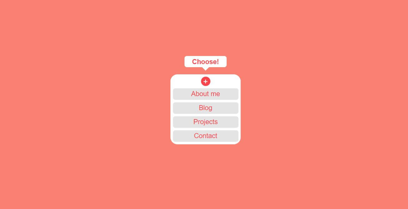
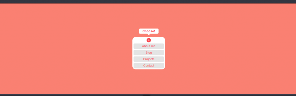
3. Hidden menu (CSS & HTML5)
This dropdown menu using css and html5 is a cool addition to homepage of any creative personal blog site or website as well. We have a plus icon saying look and slowly jumping as if its in space. Only when we hover over the icon a dropdown menu appears offering a number of menu contents. The implementation of the layout can also be seen in a number of portfolios mostly for creativity and designing related works. This creates a good first impression for the viewers. Only an icon present in a beautiful layout causes a sense of curiosity to know about more. This drives users to check the offerings and then you can guide the users to other contents.
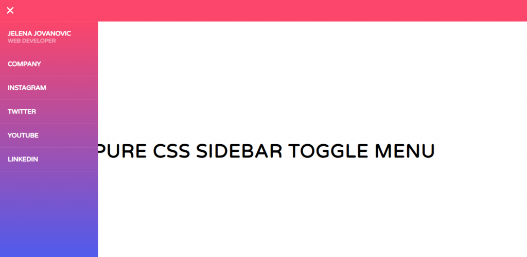
4. PURE CSS SIDEBAR TOGGLE MENU
This is one of the most common css menu examples for mobile applications. Although the screens of mobile these days are growing but still its not sufficient to hold all UI components. This requires the components to be space efficient yet be available as per necessity. In this example of sidebar menu we have another hamburger icon to hold all offerings inside in the beginning. The icon releases the sidebar components with slight animation effect. Check out our loader examples to know more on that. For real world example you can open any informative mobile application say a news application; in more than 90% of the app you’ll see similar layout. This is because the sidebar is only visible as required giving entire screen to main content. Getting the navigation menu is also easy with a sticky toggle menu always available.
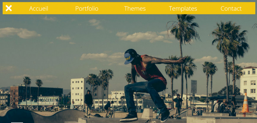
5. Responsive Slide Toggle Menu
The next one on css menu examples list is a fairly simple and effective one. The toggle menu initially as a hamburger icon release the components horizontally in a slide pull like fashion. The initial layout looks great with the toggle button not being present as extra component rather as a part of image. However, on mouse action to the button the background changes to yellow for entire menu. This would be even better if the background was more transparent which is not a big issue at all. You can enhance that part by customizing the toggle menu division with few css codes. The source code also consists of a small portion of JavaScript responsible for rendering the menu bar on click.
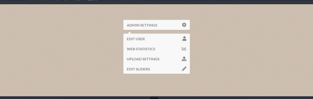
6. Dropdown Menu
So you’ve developed an amazing application with features any organization would love but its UI that’s bothering you. If you’re unsure of how you can provide the menu bar with space efficiency in a business professional manner the check this one. The layout is like of a professional application with font icons exactly matching the intended functionality. The sub menu appear as a dropdown thanks to css. Moreover, the dropdown container is entirely a new set of block separated by a margin and indicating towards parent menu by a triangular arrow. Animation for the toggle navigation menu consists of slightly darkened text font on hover for parent menu bar. While the dropdown menu sets a darker background for current selection and fades remaining components.
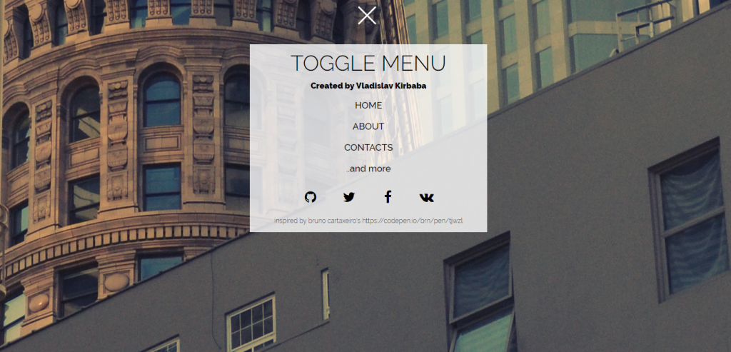
7. Toggle Menu
The toggle menu we see here is a combine result of html, css and JavaScript. Its a unique but a good way to present all the menu components along with additional information without effecting the present content. As with previous example initially there’s a toggle hamburger menu icon. The first thing you’ll notice after clicking it is its animation effect. The icon rotates in a wheel like fashion bringing down the navigation menu as a pop up from top. The navigation menu consists of animation of its own with css. Hovering effect on menu component is the change in font color and slow zooming with an underline appearing at the bottom for the most. While, the social media share and contact icons just change the theme color. The toggle menu also causes the content to slightly shift a bottom matching the synchronization between menu and content movement.
8. SLIDE TOGGLE MENU
This example of web and mobile menu consists of animation effect included all over its css code. The first thing you’ll see here a number of ways you can choose to allow your menu bar to appear. These options contain animation of its own which gives a feeling of force being applied on the button upon click. This effect is achieved by setting the border color to original background color with content being transparent.
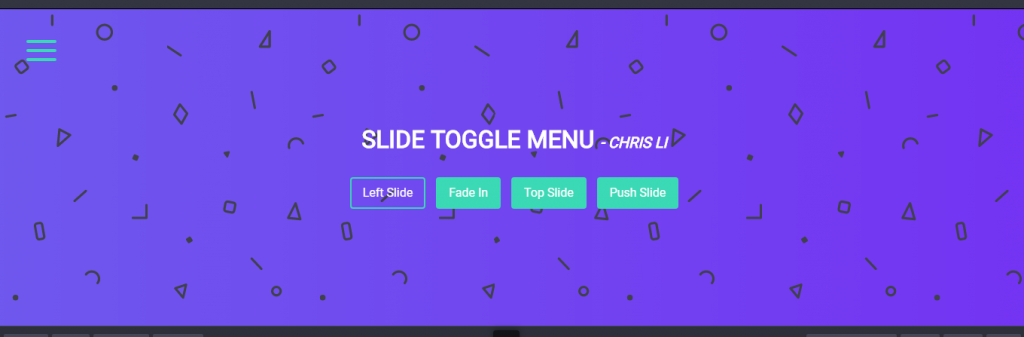
Talking about the effects, there are 4 options available. The first one is left slide which is among examples for mobile menu css. The fade in focuses on menu component only by fading away background. This css effect is useful when you want to limit navigation to specific menu only. Another is top slide which is same as fade in effect but just brings down the menu container in a sliding fashion from top. The last css toggle menu pushes the contents while bringing the mobile navigation menu from left. This adds the physical phenomenon effect to the application.
9. Menu Toggle button with flat menu
This example of toggle menu is a gem for anyone looking for simple and space efficient menu with few lines css and JavaScript. The css effect includes the hamburger icon transforming into cross icon on click while showing the drop down menu. The appearance of the dropdown menu is like that of turning the light on and off. Moreover, the menu components are highlighted as additional effect. This resource can be of good use for any web which has only few menu headers which can be shown in a beautifully crafted manner. This makes having to specify a fixed space for menu insignificant enhancing the web layout.
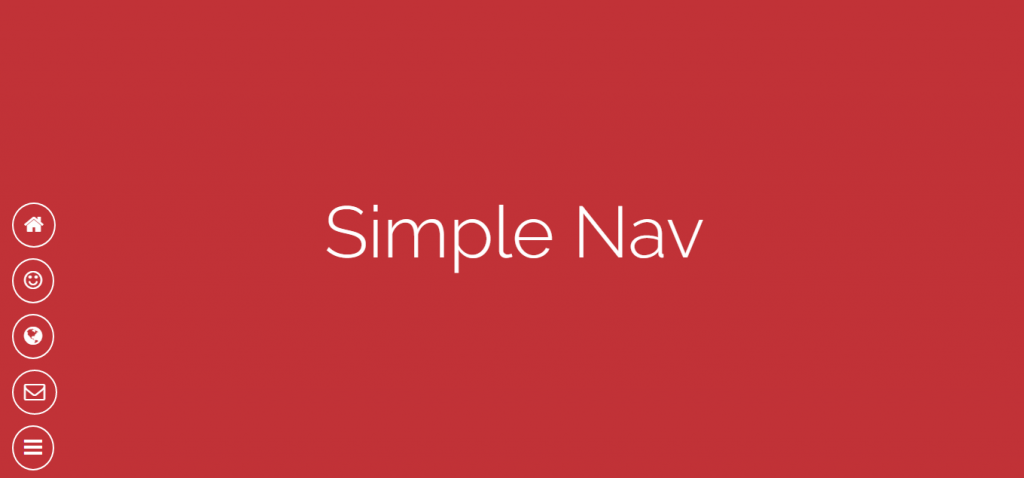
10. Simple Nav
The next on the list of toggle menu examples with css brings a rather unique way to animate the menu component icons. First of all the hamburger menu resides on the bottom corner unlike previous examples. The toggle button brings a series of similar style icons in a rather odd fashion. They look like some unbalanced atom particles which come to equilibrium after few moments only creating a vibrating effect while appearing. Additionally, not all menu components appear synchronously. A set of components appear first and the last one comes alone as if it was left by the rest at start. Whether it was an error or knowingly created css effect either way it shows us some cool way to pop up the menu components from toggle menu bar.
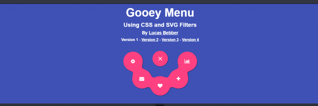
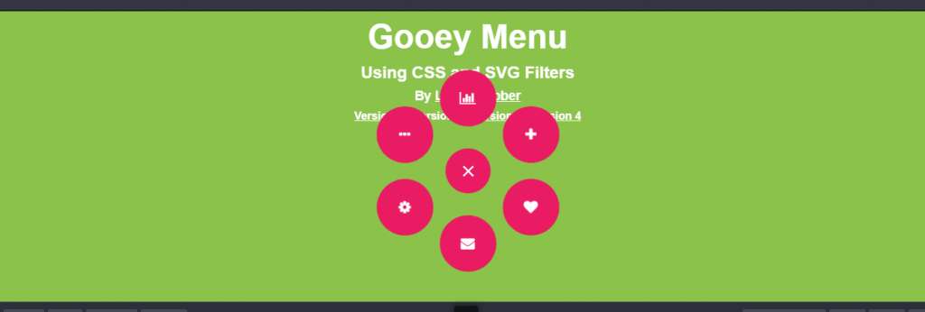
11. Gooey Menu
Animation is the main focus for this toggle menu example with 3 other version examples following after this one. So talking about the animation effect we have a relatively large toggle button in the beginning. Why large? Its because the toggle icon has been fed with all navigation menu components. As we expand the toggle menu we observe menu components coming out from it making the icon area smaller. Each menu component seems to split from the toggle menu like fission of an amoeba as a result of css effect. The components take a smiley formation smiling at the viewers. Similarly, hover effect not only lights up the selected component but also leaves a small effect on boundary of adjacent components.
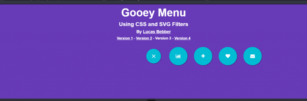
12. CSS Gooey Menu (Version 2)
We move into the second part in a four part series of the toggle css menu examples. The initial appearance and layout is same as the previous part except for the background. Also the effect is fusion, fission like effect but how they show up in the end is the difference. Whereas, in the previous version we saw each menu components attached to one another creating smiley effect, this ones are in a circle some distance apart. They look like electrons in an orbit of some element. Besides this the hovering effect and rest are all same.
13. CSS Gooey Menu (Version 3)
We’re done with the first half and start the second half with third example of css toggle menu. So, by now you might have seen the initial appearance is similar; only the final toggle effect and appearance of menu is different. To explain this, I need to take reference of some popular animation series or games. Lets take the example of Dragon Ball Z where Goku fires some energy blast from his hands. The toggle effect here is based on same. The css hamburger toggle icon shrinks and fires a number of menu components towards left like a bullet. This effect seems good for left top or bottom corner positioning of the icon.
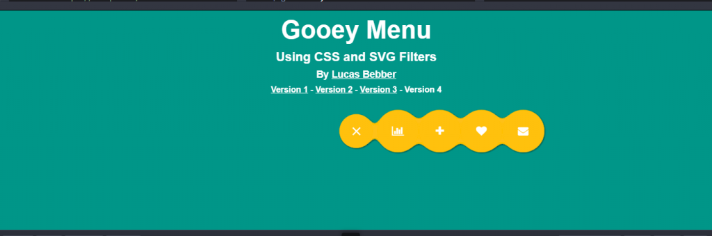
14. CSS Gooey Menu (Version 4)
The example of energy blast that I gave before seems to suit more on this final draft of the css toggle menu examples 4 part series. The styling for the toggle menu component comes from the first and third example of css gooey menu series. That is, the menu components are not separate but attached to each other while appearing as a fire forcing its way towards right. The idea for this menu example seems to come from paddle ball and using css we can achieve the same. Like the ball is attached to the racket and can travel certain distance only before returning; the toggle menu gives the same illusion.
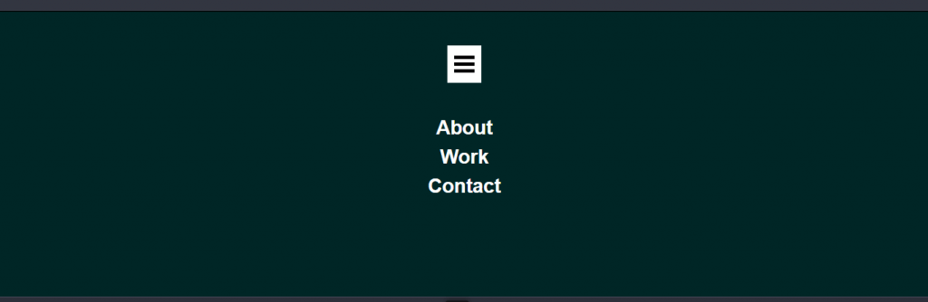
15. Vertical Layout with Navigation
The toggle menu example is a colorful use of css and javascript in order to achieve something pleasant to the eyes. Starting with the toggle effect itself, the hamburger icon pushes a container containing the menu components. Its like pushing a component attached to another component with a string which travels a certain distance and then pulls back a little. Same to this, the container just travels a little extra distance showing a little gap then taking back its prescribed position. The side bar is a good component for mobile and web menu considering flexibility offered by css. Moreover, the toggle sidebar icons offer navigation to the relevant content of the page with slide or flip like effect. You can check more on flip effects from our previous post.
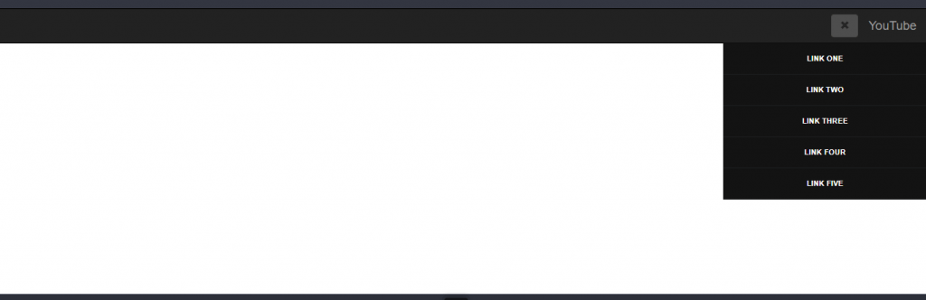
16. Bootstrap toggle menu
The bootstrap toggle menu example tries to show a dropdown menu using css that will be useful in video streaming platform like YouTube. While the UI may not exactly show that but idea is the same. We can see such toggle menu available for a number of google applications and other applications requiring sign in. Every application allows a set of action and self service for its user. These actions are present all the time as well as hidden all the time. It is present in terms of some toggle bar which slides down the offering contents. The effect shown in the example is like that of a remote controlled garage door slowly shuts down on closing and similarly slides up on opening.
17. Simple Toggle Menu
You might have seen a famous magic trick where the magician shows an empty hand and upon few swipes by other hand something magically appears. We know in reality something was always there just not visible to us initially. Its like writing with an invisible ink and the showing the writing in some light color. You may think why am I talking about magic and invisible ink. Its because the next magic trick comes from css toggle dropdown menu example. The hamburger icon is like an empty hand and the sliding of another hand is click on the icon. This brings down a dark green layer from top which makes the toggle navigation menu components visible. Unlike other css toggle menu examples this one doesn’t contain any animation for hamburger icon itself. You can obviously enhance that from code below.
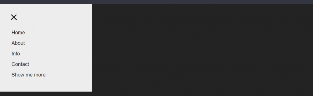
18. Responsive navigation mobile menu toggle
We have a window curtains puller like toggle button for next navigation menu example. Content is the king and you don’t interrupt the way of any king. In the same context the example shows full allocation for content without any disturbance to be seen anywhere around. However, there a couple of angle brackets of just enough size to be recognized while surfing around. This pulls the navigation menu components for us. The toggle menu layer and the content layer act as completely different layers. The content layer is overlapping the menu layer initially. When we use the toggle menu button the css effect doesn’t simple bring the menu layer to front while content layer being consistent. The css design for the toggle dropdown menu is responsive so that the content layer transits accordingly. This makes content unaffected all the time.
19. Pure CSS Hamburger fold-out menu
Know CSS only and want a simple menu layout for navigation in mobile application then have a look at this example. You get an extra storage space for a small mobile screen with this effect. Not the way you may be thinking but its logically the same. The extra space you get is not for displaying anything but to hide the sidebar initially. Then you can simply pull the container from the hidden area by toggle menu icon. Simple and effective solution to mobile navigation menu option using css to say the least.
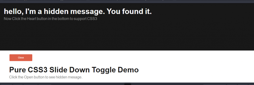
20. Pure CSS3 Slide Down Toggle
Want some hide and seek game in your website? Have a look at this pure css toggle dropdown menu example if so. This type of toggle option are useful of contents which are just important enough to be included i the website while not so important to be shown all the time. You can choose to see it quickly when required else keep it hidden other time. The idea is very common for anyone who has knowledge on css. The content you want to hide initially is kept under the division with display, visibility or overflow set to hidden and upon some action only the property changes to visible. This is not it though, its so much important to make rest of the content responsive for better user experience and it is exactly what’s done here.
21. Creative Menu Toggle Button With Flat Menu
The flat menu bar gets its inspiration from power scale tape used for measurement in construction field. The toggle menu here operates just like a slider responsible for fixing the scale limit and using the same slider to pull back the scale inside. The hover effect on navigation menu component turns the font color from black to white. While being opposite to the dropdown css menu this menu shows the menu on a horizontal alignment. Because of this nature its most likely to suit web version only but change on alignment to horizontal from css can make it a mobile menu example.
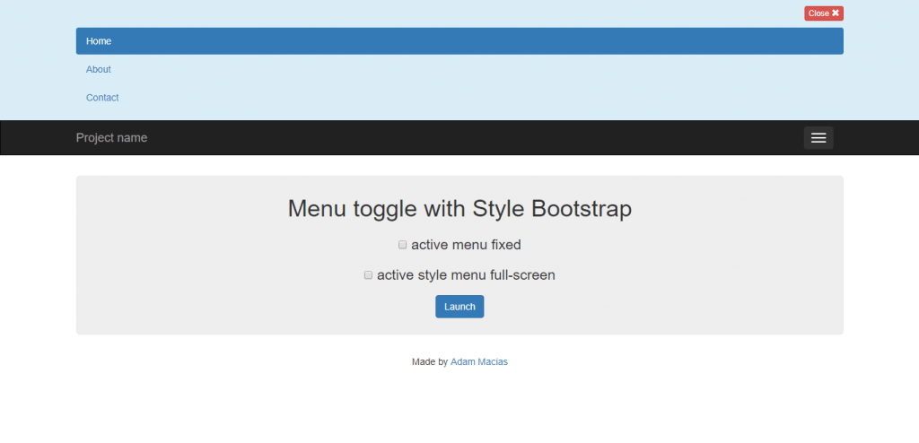
22. Menu toggle with Style Bootstrap
With this dropdown menu you can customize the layout to your requirement with simple css. You want your content to be responsive while dropdown menu offers its present by default. If its okay for your website to overlap the content and avoid sliders that’s also available. Finally, if you wish to have a full screen dropdown not many css menu examples may offer that but this one do. However, its better to have a transparent background for the menu container to have a pleasant overall user interface.
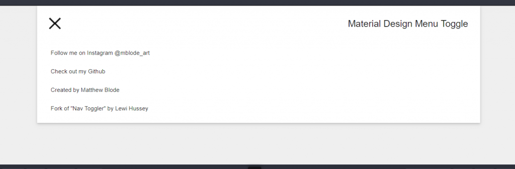
23. Material Design Menu
We end today’s list of css dropdown menu examples with a simple menu slider for web and mobile friendly result. Its just like slightly stretching the menu container to make a larger view area. More than header menu it could be useful in scenarios where additional detail on related topic requires to be shown. For example, consider a long post on some topic. To make the layout readable Facebook allows a read more option which expands the visibility height for that post. This could be useful in something like that. Alternatively, consider a e-commerce site with laptop category and toggle button will show all the manufacturers for the laptop available for navigation. These are the only few usage example. You can apply the effect for most of web space optimization requirement.
Conclusion
Its not the matter of why toggle menu but which menu suits the best to your application requirement. We hope that this article was helpful to decide a menu for getting started or to improve the navigation option in your website.
If you’re using a single page web layout then its a must to include navigation menu. Choosing toggle option or not is up to you but current trend and user reviews suggest go for combined sticky menu toggle option.