


The concept of expand and collapse in web designing comes when you don’t want viewers to be driven away by contents at the very beginning. As we have said multiple times its not just content but how you provide the content for viewers. This means that you shouldn’t throw away all the contents to viewers at once but provide them the option to explore for more. A number of react collapse component does the same by providing sufficient horizontal and vertical dimension for contents to appear as per user requirement. These react component also referred as accordion use javascript to expand and collapse the container along with css for styling.
What makes react accordion popular is that its ability to align related pieces of web together. You will see a number of example easily getting into FAQ section below and this is because each items appear in correlated fashion. The basically have one job that is to set visibility of content on click back and forth. Despite having single responsibility its a core component for menu, navigation options and sidebars.
Collection Of Ten Best Accordion React Collapse Component Code Snippet
While you may have been in confusion before whether that be for efficient space management or cool transition effect, this is the one stop solution with react collapse components. We have brought 10+ examples of react collapse for both vertical and horizontal menu alignment. Most of them rely on JavaScript code for collapse and other properties shown. Check out the examples to see if you can find one for your project or can create a better one.
Related
- Dropdown menu with CSS
- React custom scrollbar component
- Best react menu component
- React tree view component
- Excellent SVG Loader Animated
1. Accessible Accordion component for React
The first example on the react collapse component is a layout very popular in FAQ section. There are multiple options for expanding and collapsing any header on the basis of varying requirement. By default we get a react accordion component where only one item can be expanded. In order to collapse this accordion, you need to expand another component. With this style we can allow a fixed space allocation for such section which will never go beyond the limit and also doesn’t waste any space. Another style is a multiple selection of vertical react collapse item. This allows previously expanded react accordion to remain open while expanding another one. Such styling becomes very useful in the situation where multiple components are interrelated.

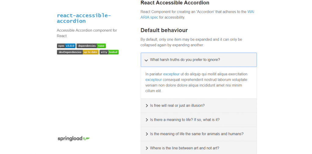
You can choose from 5-6 behavior styles for the react component. Options vary from always allowing one item to remain on expand state by enabling collapse option only after next selection to multiple item selection. While FAQ maybe the most common utilization of this accordion, it is also useful in many nested sidebar menu.
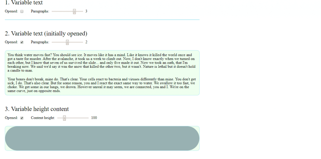
2. Collapse animation with react-motion
The next react collapse component brings 8 different styles and behaviors to show content in pop up fashion. The first one is variable text container which allows dynamic addition of paragraphs while second one is same but initially open. Similarly, we can choose to have a variable height on the basis on asynchronously receiving data or set a fix height if contents don’t vary. These react collapse component be controlled from horizontal slider.

Let’s talk further on animation for the react collapse component. With custom configuration we can set behavior to stiff, wobbly, gentle or no wobble. Its only the matter of how much interactive and visual enhancement you want to include for your application. We might have seen these type of react component as alert or some notification in different applications. They appear with some information and the we can collapse it to continue with the actual work.
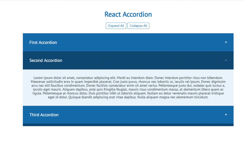
3. React Accordion
The toggle accordion component gives a business class look often seen in business websites. The animation effect for the react collapse component includes darkening the background on selection and some cool rotating action on plus sign to transform it into minus. These signs also act as indicator to represent further click actions on them. The accordion makes the use of CSS and JavaScript for expand and collapse action. Even the contents come from JavaScript rather than HTML with visible property on expand and hidden for collapse.

For easiness there’s an option to expand all and collapse all button. You can expand all and then go through them without burden of having to navigate to expand option. Also, you don’t have to close all items one by one with the help of these buttons.
4. Accordion react component with animation
The react component we have here is a initially closed multiple item selection accordion with animation. The animation include arrow sign to direct either expanding or collapsing of the items. Moreover, the opening of item transition is like smooth expanding a layer in between two compressed components.


The layout and behavior of the JavaScript react collapse component makes it a good element for manuals and documentation. With each chapter and topics categorization just like above items, we have a default index for easy navigation. We are aware that users are always in a hurry and want quick information and this one does exactly the same.
5. ReactJS Collapse component demo
Its never a good idea to give all the information in detail to the viewers right at the start. There will always be a number of contents and its not easy to decide which visitor will go for which one. So, its more ideal to have only a small portion of content display at the beginning. Like showing only cover image, title, short description and key points. However, its necessary to give them option to view in detail if necessary. This one seems to bring the inspiration from view details option commonly seen in Facebook, YouTube and almost every second web page.

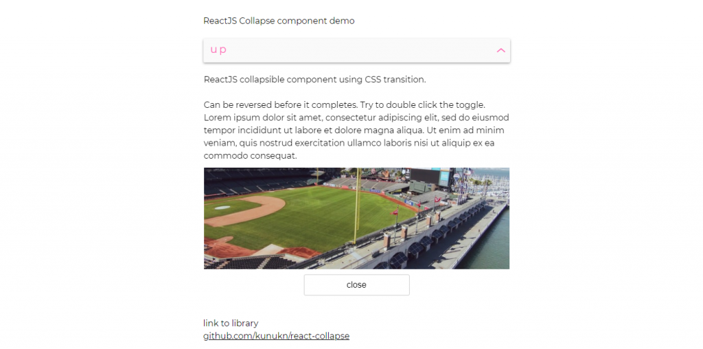
The data comes asynchronously after we click on the collapsible item along with detail text and images. Real life example can be a tours and travels website where we only see destination in the beginning and only after mouse action we get details relevant to it. Details may include video clips, tickets and offers etc. Moreover, if you’re not interested simple collapse the react component and explore the next one. This adds to functionality and layout of the website for better user experience.
6. React collapsible
Collapsible component offers a single panel or multiple items under group panel to meet a number of requirements. Popular implementation of such react collapse component is when you’re creating an online account and then there’s one category where you have to select and answer security question. You expand the question, answer the question and the collapse it simple as that. This makes the category easily distinguishable with toggle effect.

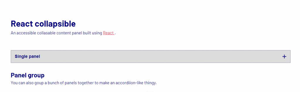
Besides form, the layout also serves a good element for instruction documentation. They sort out major queries by highlighting the topic and answering them to the point.
7. React – Collapse Example
The react collapse component we have here is a dropdown menu for selecting an item among a set of fixed choices. It has application as a menu header itself or item selection in form or filter. While the react example shows vertical dropdown menu may in horizontal arrangement with vertical collapse component.


The animation includes smooth sliding of the dropdown content from topic header distinguishable from background color. Much effort on styling hasn’t been done with just few lines of CSS code. Its mainly javascript responsible for collapse and content source in the react example. However, you can show your creativity and achieve something more appealing to eyes.
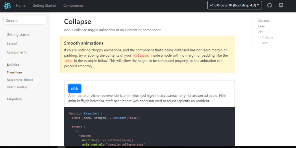
8. React bootstrap
With few lines of css transition code on multiple components we can turn them into composable nature. The react collapse example offers to types of appearing and collapsing nature. Firstly, the animation effect includes shifting the rest of the content downward allowing space for hidden content and reverse action for collapse using javascript. Second effect is fading where the contents are set visible or hidden on the basis of click action. Whether you choose auto computation of content height or specify a fix one will direct you to make the choice among these.

9. React Collapse / Accordion
By now it might have occurred to your mind that what if you have a number of collapse component which may not be accessible right away. Take the example of terms, conditions and policies you see while filling online forms. While most of us simple choose to ignore it and simply tick on accept option, some companies want their users to read them. Until and unless they have opened and gone through the policies they won’t allow selection of further components. This react collapse / accordion component comes with feature to disable certain items as per requirement. While hovering through these items a stop or not applicable icons show up to indicate disabling.


Further, the example shows the implementation of a simple layout or inclusion of icons to make them as per our custom need. The compatibility for this react collapse component ranges from chrome, safari, Firefox to IE 8 and above.
10. React collapse Component
This example of react collapse component is a component wrapper for collapse animation. This comes with CSS for elements of variable and dynamic height. As seen in the example, the indicator shows collapsed or expanded status on the label itself. The ability to track this action from user can be helpful in other situations as well. Contents slide down the details under the topics with responsive design with other contents also sliding down respectively.


For animation there’s option to include our custom transitions in the style sheet. More on props detail and documentation from link below.
11. React Nested Collapse
The final example of react collapse component consists of container within a toggle container. That means we can apply collapse action on child container for single collapse action or apply it directly to parent container for collapse all feature. This feature is very similar to tree view component that we have covered in our previous post.

The advantage and application of such collapse option is of course the tree structure view for proper categorization of contents as we just said. Moreover, the styling is also a good component for alert and notification actions. Many sites these days include social media contents as a side bar option which dynamically updates over a certain period of time. Rather than reloading the entire page, its more efficient to show fresh contents in this manner. Also, you can provide the option to collapse some contents for users. With horizontal slider we can specify height for react collapse component. However, the react horizontal slider sets the height of only child collapse component. This is because parent container adjusts accordingly.
Conclusion
Hence, with the last example we come to the conclusion of react collapse component. One thing we hope that you got is collapse component contribute to easy navigation of related topic by showing contents just below it when required. It completely takes away the need of scrolling as the elements are present just adjacent to header. This contributes to enhanced user interface and user experience at the same time.